

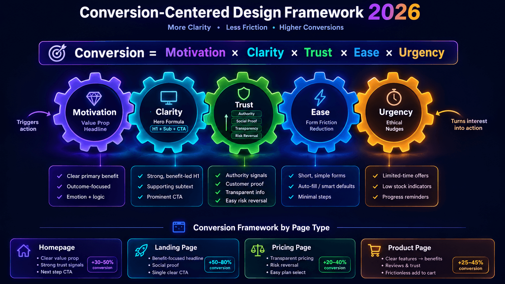
Getting a website to look good is the easy part. Getting it to convert, to turn a stranger who lands on a page into someone who signs up, buys, books a call, or fills out a form, is a discipline of its own. It sits at the intersection of psychology, visual design, copywriting, engineering, and analytics, and in 2026 the bar is higher than it has ever been. Visitors arrive with shorter attention spans, higher expectations, and an instinctive distrust of anything that feels slow, cluttered, or manipulative. A beautiful design that does not convert is, from a business point of view, a very expensive piece of art.
At UI Designer, our team has spent years building and rebuilding interfaces for clients across SaaS, ecommerce, fintech, healthcare, and professional services, and the same lesson keeps surfacing: conversion is not a trick you sprinkle on at the end. It is a decision you make at the very beginning and defend through every screen, every headline, and every button. Good UI/UX design is what makes conversion feel effortless to the visitor and inevitable for the business.
This guide walks through how we approach designing a high-converting website in 2026, from the first strategic questions to the final round of analytics-driven iteration. It is meant to be practical rather than theoretical, so we have included concrete numbers, specific techniques, and the reasoning behind them. Whether you are building a landing page for a single campaign or a full multi-page web design system, the principles below will help you turn more of your traffic into results.
Start With the Conversion, Not the Canvas
Before anyone opens a design tool, we ask a deceptively simple question: what is the single most valuable action a visitor can take on this page? Every high-converting page has one primary goal. It might be a demo request, a purchase, a newsletter signup, or a phone call. When a page tries to do five things at once, it usually does all of them badly, because every additional option dilutes attention and increases the cognitive load on the visitor.
Conversion-centered design begins by defining that primary goal, then ruthlessly aligning the layout, copy, and visuals around it. Secondary actions can exist, but they must visibly take a back seat. If your primary goal is a paid signup, then a low-commitment secondary action such as watching a product tour can support it, but it should never compete for the same visual weight. We think of this as attention budgeting: you have a limited amount of visitor attention, and you should spend it deliberately.
It also helps to map the intent of the traffic arriving on the page. Someone clicking a branded search result already knows who you are and needs reassurance and a fast path to action. Someone arriving from a cold ad needs education and trust-building before any ask. A high-converting page respects where the visitor is in their journey. This is the strategic layer of user experience that most teams skip, and it is precisely why so many visually polished sites still underperform. Design decisions made without a conversion hypothesis are just decoration.
Above the Fold: Winning the First Five Seconds
The area a visitor sees before scrolling still carries an outsized share of the conversion load. Research on attention consistently shows that people decide within a few seconds whether a page is worth their time, and a large majority of that early attention lands above the fold. This is the moment where you either earn the scroll or lose the visitor entirely, so it deserves disproportionate design effort.
An effective above-the-fold section answers three questions almost instantly: what is this, who is it for, and what should I do next. The headline should communicate a clear, specific value proposition rather than a clever slogan that means nothing to a first-time visitor. A subheadline can add the supporting detail. A single prominent conversion-centered-design-framework-2026" class="internal-link">call to action gives the ready visitor an immediate path forward. And a supporting visual, ideally a real product screenshot or an authentic image rather than a generic stock photo, grounds the promise in something concrete.
We are careful about what we place in this space. Autoplaying carousels, oversized hero videos that delay interaction, and vague aspirational imagery tend to hurt more than they help. In our experience, a focused hero with one message and one action almost always outperforms a busy one. The goal is clarity, not spectacle. If a visitor cannot tell what you offer and why it matters within five seconds, no amount of scrolling will rescue the conversion, because most people will never scroll at all.
Visual Hierarchy That Guides the Eye
Visual hierarchy is the art of controlling the order in which a visitor notices things. On a high-converting page, nothing is accidental: the eye is led, step by step, from the value proposition to the proof to the action. When hierarchy is weak, everything shouts at once, the visitor feels overwhelmed, and the most common response to overwhelm is to leave.
The main levers of hierarchy are size, color, wcag-2026" class="internal-link">contrast, spacing, and position. A headline should be unmistakably larger than body text. The primary conversion-centered-design-framework-2026" class="internal-link">call to action should use a color that stands apart from everything around it, which is only possible if the rest of the palette is restrained. Generous whitespace is not wasted space; it is what gives important elements room to breathe and be seen. We often improve a page's clarity not by adding anything but by removing competing elements and increasing the space around what remains.
wcag-2026" class="internal-link">Contrast deserves special attention because it does double duty for both hierarchy and wcag-2026" class="internal-link">accessibility. A button that barely stands out from its background will be missed by some visitors and ignored by others. We aim for strong, deliberate wcag-2026" class="internal-link">contrast on anything we want people to act on, and we test how the page reads when squinting or viewing a blurred version, a quick trick that reveals whether the intended focal points actually dominate. Strong UI/UX design uses hierarchy so that even a distracted visitor, skimming at speed, still absorbs the message and finds the path forward.
Designing Calls to Action That People Actually Click
The conversion-centered-design-framework-2026" class="internal-link">call to action is where intention becomes conversion, and it is astonishing how often it is treated as an afterthought. A great CTA is a combination of copy, design, placement, and context, and each of those elements can meaningfully move your conversion rate.
Start with the words. Generic labels like Submit or Click Here ask the visitor to do work with no reward in sight. Specific, value-oriented copy performs better because it tells people exactly what they get: Start My Free Trial, Get My Custom Quote, Book a 15-Minute Call. Writing the button from the visitor's point of view, using first-person phrasing, often produces a measurable lift because it feels like a choice they are making rather than a command they are following.
Design and placement matter just as much. The primary CTA should be visually dominant, comfortably large enough to tap on a phone, and repeated at natural decision points down a long page rather than appearing only once at the top. Around the button, reducing perceived risk helps enormously: a short reassurance such as no credit card required, cancel anytime, or takes under a minute can lift completions because it removes the hesitation that stops a hovering click. On a focused landing page, we generally recommend a single primary action repeated consistently rather than a scattering of competing buttons, so the visitor is never forced to choose between conversions.
Building Trust Before You Ask for Anything
People do not convert on sites they do not trust, and trust in 2026 is harder to earn than ever. Visitors have been burned by dark patterns, fake reviews, and misleading claims, so they arrive skeptical. The job of a high-converting page is to systematically dismantle that skepticism before the moment of the ask, and that means weaving conversion-centered-design-framework-2026" class="internal-link">trust signals throughout the experience rather than confining them to a single testimonials block.
Trust is cumulative. Every credible detail adds a little, and every rough edge, a typo, a broken link, a stock photo that screams inauthenticity, quietly subtracts. The most persuasive conversion-centered-design-framework-2026" class="internal-link">trust signals are specific and verifiable rather than vague and self-congratulatory. A precise number, a named customer, a real photograph, and a recognizable logo all carry more weight than an adjective ever will.
Here are the trust elements we most often deploy, roughly in order of impact:
- Genuine customer testimonials with a full name, role, company, and photo, because attributed quotes are far more believable than anonymous praise.
- Quantified results and social proof, such as the number of customers served, projects delivered, or a concrete outcome a client achieved.
- Recognizable client or partner logos, which borrow credibility from brands the visitor already trusts.
- Third-party validation like independent review scores, certifications, security badges, and press mentions.
- Clear, honest pricing and transparent policies, since hidden costs and vague terms are among the fastest ways to lose a sale.
- Human signals such as real team photos, a physical address, and responsive support options that prove there are actual people behind the brand.
Placement matters as much as presence. We position conversion-centered-design-framework-2026" class="internal-link">trust signals near friction points, so a testimonial or a security badge appears right where the visitor is being asked to commit. Reassurance delivered at the exact moment of doubt is worth far more than the same reassurance buried three sections away.
Forms That Do Not Scare People Away
For many businesses the form is the conversion, and it is also one of the biggest points of abandonment. Every field you add is a small tax on the visitor's willingness to continue, and that tax compounds quickly. The single most reliable way to increase form conversions is to ask for less. If you do not truly need a phone number, a company size, or a job title to follow up effectively, do not ask for it yet.
We design forms around the principle of matching the ask to the value. A visitor will happily give a lot of information to download a substantial, clearly valuable resource, but will resent handing over the same details just to see pricing. Progressive disclosure helps here: capture the minimum up front, then gather more later once a relationship exists. Breaking a longer form into clearly signposted steps with a visible progress indicator can also reduce the intimidation of a wall of fields, provided the total effort stays honest.
The mechanics of the form experience deserve real attention too, because small usability failures cause large drop-offs. Inline validation that confirms a correct entry or flags an error in the moment is far less frustrating than an error summary that appears only after submission. Labels should sit above fields rather than vanishing as placeholders. Input types should trigger the correct mobile keyboard, so an email field brings up the email keyboard and a phone field the number pad. And the submit button should describe the outcome, restate the value, and never leave the visitor wondering whether their click registered. A confident, low-friction form is often the highest-leverage improvement we can make to an entire funnel.
Page Speed Is a Conversion Feature
Speed is not a technical nicety; it is a direct input to your conversion rate. Study after study has shown that as load time climbs, conversions fall, and the effect is steep. Moving from a one-second to a three-second load can measurably increase bounce probability, and each additional second of delay tends to shave a meaningful percentage off conversions. In a world of fast mobile connections and even faster expectations, a slow site loses money on every visit.
In 2026, Google's Core Web Vitals remain a useful framework for the aspects of speed that visitors actually feel. Largest Contentful Paint measures how quickly the main content appears and should generally land under two and a half seconds. Interaction to Next Paint captures how responsive the page feels when someone taps or clicks. Cumulative Layout Shift measures how much the page jumps around as it loads, which is the maddening experience of reaching for a button just as it moves. These metrics matter both because they influence search rankings and, more importantly, because they correlate with how trustworthy and polished a site feels.
The good news is that most speed problems are solvable with well-understood techniques. We compress and correctly size images, serve them in modern formats such as WebP or AVIF, and lazy-load anything below the fold. We minimize and defer non-critical JavaScript, since heavy scripts are the most common cause of sluggish interactivity. We reserve space for images and embeds so the layout does not shift. And we lean on caching and a content delivery network so returning visitors and distant visitors alike get a fast first paint. Performance work rarely gets the credit it deserves, but it is one of the most dependable ways to lift conversions without changing a single word of copy.
Mobile-First Conversion in a Small-Screen World
The majority of web traffic now arrives on phones, and for many industries mobile visitors already outnumber desktop by a wide margin. Yet a surprising number of sites are still designed on large monitors and only checked on mobile as an afterthought. That order is backwards. Designing mobile-first forces the discipline of prioritization, because the small screen simply cannot fit everything, and that constraint tends to produce clearer, more focused pages on every device.
Responsive design is the baseline, but true mobile conversion goes further than a layout that merely reflows. Touch targets need to be large enough to tap confidently, generally at least around forty-four pixels, with enough spacing that a thumb does not hit the wrong element. Primary actions should sit within easy reach of the thumb rather than stranded in a top corner. Text must be legible without pinching, forms must be short and keyboard-aware, and any interaction that depends on hovering, which does not exist on touch, needs a tap-friendly alternative.
We also pay close attention to the realities of mobile context. Mobile visitors are often on slower or less stable connections, more easily distracted, and frequently trying to accomplish something quickly. That makes speed, clarity, and a single obvious next step even more critical than on desktop. Sticky calls to action that remain accessible as the visitor scrolls, click-to-call buttons for businesses that convert over the phone, and streamlined checkout with mobile payment options all recognize how people actually behave on their phones. A responsive design that looks fine but ignores mobile behavior will still leave conversions on the table.
Accessibility Is Conversion, Not Just Compliance
wcag-2026" class="internal-link">Accessibility is too often framed purely as a legal obligation, which undersells its impact. Designing for the full range of human ability expands your addressable audience, since a significant share of people live with some form of disability, and it improves the experience for everyone else as a byproduct. Captions help people in noisy environments, high wcag-2026" class="internal-link">contrast helps people in bright sunlight, and clear focus states help anyone navigating quickly by keyboard. Accessible design is simply better user experience, and better user experience converts.
There is also a strong overlap between wcag-2026" class="internal-link">accessibility best practices and conversion best practices. The same clear wcag-2026" class="internal-link">contrast that helps a low-vision visitor read your conversion-centered-design-framework-2026" class="internal-link">call to action also makes that button more noticeable to everyone. The same logical heading structure that lets a wcag-2026" class="internal-link">screen reader user navigate efficiently also helps sighted visitors skim and helps search engines understand your page. When we improve wcag-2026" class="internal-link">accessibility, we routinely see clarity and usability improve alongside it, which is exactly why we treat it as a core part of conversion design rather than a checklist bolted on at the end.
Here are wcag-2026" class="internal-link">accessibility practices that also tend to lift conversions:
- Sufficient color contrast between text and background, meeting at least the standard ratio, so content stays readable for aging eyes and bright screens alike.
- Descriptive alternative text on meaningful images, which aids screen readers and adds relevant context for search engines.
- A clear, visible focus indicator and full keyboard navigation, so people who cannot or prefer not to use a mouse can still complete a purchase or form.
- Properly labeled form fields and helpful error messages, which reduce confusion and abandonment for every visitor, not only those using assistive technology.
- Logical heading hierarchy and semantic structure, which improves both screen reader navigation and skim-readability.
- Avoiding reliance on color alone to convey meaning, so an error or a required field is communicated in more than one way.
Treating wcag-2026" class="internal-link">accessibility as an afterthought is not only a legal risk; it is a conversion leak. Every visitor who cannot read your text, find your button, or complete your form is a lost customer, and building inclusively closes those leaks while widening your reach.
Measure, Test, and Iterate With Real Data
No matter how experienced the team, the first version of a page is a hypothesis, not a conclusion. High-converting websites are the product of disciplined measurement and iteration, not a single stroke of creative genius. This is where conversion rate optimization becomes an ongoing practice rather than a one-time project, and it is the phase that separates sites that plateau from sites that keep improving.
The foundation is honest analytics. We instrument each page to track its primary conversion, then work backward to understand the funnel: how many visitors arrive, how many scroll past the fold, how many begin the form, and how many finish. Quantitative tools tell you what is happening, and qualitative tools tell you why. Heatmaps reveal where attention concentrates and where it dies. Session recordings expose the moments of confusion where a visitor hovers, hesitates, and leaves. Reading a handful of recordings of real people struggling with a page is often more instructive than any report.
From there, improvement becomes methodical rather than guesswork:
- Form a clear hypothesis tied to a specific problem, such as a suspicion that a long form is causing mobile abandonment.
- Change one meaningful variable at a time so you can attribute any difference in results to a real cause.
- Run A/B tests until you reach a sample size large enough to trust, resisting the urge to call a winner after a handful of conversions.
- Prioritize tests by expected impact and effort, focusing first on high-traffic pages and the biggest drop-off points in the funnel.
- Document what you learn, because a losing test still teaches you something durable about your audience.
Perhaps the most important mindset here is patience and humility. Some of our most confident predictions have been overturned by the data, and some modest-looking changes have produced outsized gains. Conversion rate optimization rewards teams that stay curious, keep testing, and let evidence rather than ego guide the roadmap. A website is never finished; it is continuously tuned against the behavior of the people who actually use it.
Final Thoughts
Designing a high-converting website in 2026 is not about chasing the latest visual trend or copying whatever a competitor did last quarter. It is about a coherent chain of decisions that all point at the same goal: understanding your visitor, earning their trust, guiding their attention, removing every unnecessary obstacle, and making the desired action feel like the obvious next step. When strategy, visual hierarchy, persuasive calls to action, credible conversion-centered-design-framework-2026" class="internal-link">trust signals, frictionless forms, fast performance, mobile-first thinking, and genuine wcag-2026" class="internal-link">accessibility all pull in the same direction, conversion stops feeling like a struggle and starts feeling natural.
The encouraging truth is that most websites have significant room to improve, because so few get all of these fundamentals right at once. You do not need a complete redesign to see results; a sharper headline, a faster load, a shorter form, or a clearer conversion-centered-design-framework-2026" class="internal-link">call to action can each move the needle on its own. Start with the changes that address your biggest drop-off points, measure honestly, and keep iterating. Small, evidence-based improvements compound into a website that works harder for your business every single month.
If you would like a partner to help turn these principles into a site that measurably converts, our team at UI Designer works with businesses around the world on exactly this kind of conversion-focused UI/UX design, responsive design, and web design work. However you proceed, we hope this guide gives you a practical foundation for building a website that does not just look impressive but genuinely earns the results your business depends on.