

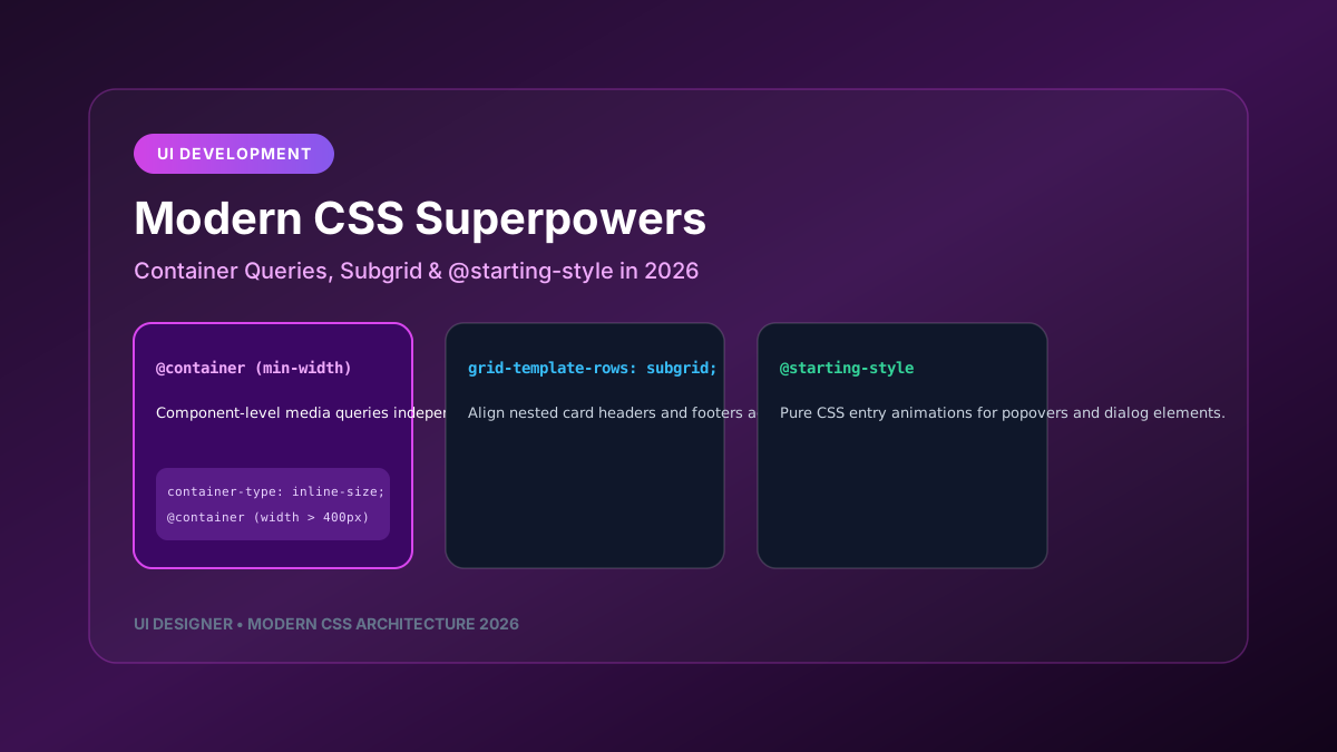
Modern CSS has evolved at a rapid pace. Features that previously required JavaScript utility libraries or complex hacky layouts are now native CSS primitives. In 2026, CSS features like **mobile-first-design-strategy-2026" class="internal-link">Container Queries (`@container`)**, **Subgrid (`grid-template-rows: subgrid`)**, and **`@starting-style`** allow UI developers to build truly modular, resilient component layouts.
---
1. Container Queries: Responsive Components, Not Responsive Viewports
Media queries (`@media (min-width: 768px)`) measure the entire browser viewport width. But a card component rendering in a narrow sidebar shouldn't behave the same as when rendering in a wide main content area. **mobile-first-design-strategy-2026" class="internal-link">Container Queries** evaluate the width of the parent container holding the component.
/* Step 1: Define Container Context on Parent Element */
.card-wrapper-container {
  container-type: inline-size;
  container-name: product-card;
}
/* Step 2: Apply Component Styles Based on Parent Container Width */ .product-card-component { display: flex; flex-direction: column; gap: 1rem; }
/* When the parent container is wider than 400px, switch to row layout */ @container product-card (min-width: 400px) { .product-card-component { flex-direction: row; align-items: center; } }
---
2. CSS Subgrid: Perfect Multi-Card Alignment
When displaying a grid of cards with variable text lengths, aligning card titles, descriptions, and call-to-action buttons across separate cards used to require fixed heights or JavaScript layout calculations. **CSS Subgrid** forces child grid items to participate in the parent's grid tracks.
/* Parent Grid Layout */
.card-grid-container {
  display: grid;
  grid-template-columns: repeat(auto-fit, minmax(280px, 1fr));
  gap: 1.5rem;
}
/* Subgrid Card Item */ .card-item { display: grid; grid-template-rows: auto 1fr auto; /* Header, Body, Footer */ grid-row: span 3; }
/* Force inner elements to align perfectly across grid rows */ .card-item-nested { display: grid; grid-template-rows: subgrid; }
---
3. Pure CSS Entry & Exit Animations with `@starting-style`
Animating popovers, tooltips, or `
/* Dialog Entry Animation with @starting-style */
dialog {
  opacity: 1;
  transform: scale(1);
  transition: opacity 0.3s ease, transform 0.3s cubic-bezier(0.34, 1.56, 0.64, 1);
}
/* Starting state before dialog mounts into view */ @starting-style { dialog { opacity: 0; transform: scale(0.9); } }
---
4. Modern CSS Color Functions: `color-mix()` & OKLCH
`color-mix()` and the OKLCH color space allow developers to generate dynamic hover states, semi-transparent tints, and harmonious accessible palettes without needing Sass preprocessors.
:root {
  --brand-primary: oklch(0.65 0.24 290);
}
.button-hover-effect:hover { /* Dynamically mix 15% black into brand color on hover */ background-color: color-mix(in oklch, var(--brand-primary), black 15%); }
Leveraging modern CSS superpowers simplifies component codebases, boosts rendering speed, and unlocks truly modular design systems.