

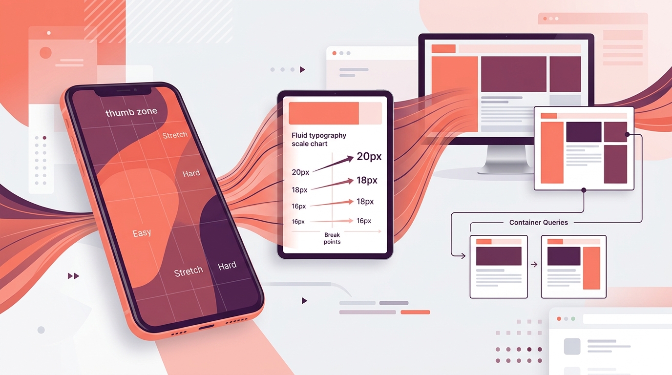
"Mobile-first" has been the industry mantra for a decade. Yet most websites are still designed on 1440px screens, handed to developers as desktop mockups, and "made responsive" as an afterthought. The result: mobile experiences that feel like shrunken desktop sites — slow, cluttered, and frustrating.
This guide explains why your desktop-first approach is failing, what true mobile-first design looks like in 2026, and how to restructure your process to ship mobile experiences that convert.
The Reality Check: Your Users Are Mobile
| Statistic | Source | Implication | |-----------|--------|-------------| | 60–75% of web traffic is mobile | StatCounter, 2024 | Majority experience is mobile | | 53% abandon if mobile load >3s | Google | Speed = revenue | | Mobile conversion rates 30–50% lower than desktop | Monetate | Mobile UX gap = lost money | | 70% of B2B searches happen on mobile | Google | Even "desktop" buyers research on phone | | Google indexes mobile version only | Mobile-First Indexing | Mobile *is* your SEO |
**If your mobile experience is an afterthought, your business is an afterthought to mobile users.**
Why Desktop-First Fails
1. Content Priority Inversion
Desktop-first: "We have space for hero + value props + features + testimonials + newsletter + footer." Mobile reality: User sees hero + *maybe* one value prop before scrolling. Everything else is buried.
2. Interaction Assumptions
Desktop: Hover states, right-click, keyboard shortcuts, precise cursor, multi-window. Mobile: Tap, swipe, scroll, long-press, pull-to-refresh, back gesture. **No hover. No right-click. No keyboard (until input).**
3. Performance Debt
Desktop-first assets (2000px images, heavy JS, complex animations) shipped to mobile → penalized by Core Web Vitals, higher bounce, lower rankings.
4. Touch Target Neglect
44×44px minimum (Apple) / 48×48dp (Material) — desktop designs often have 20px links, tight icon clusters, impossible on thumb.
5. Context Blindness
Mobile users are: standing, walking, one-handed, distracted, poor connectivity, bright sunlight, small screen. Desktop designs assume: seated, focused, fast wifi, large screen, two hands.
What True Mobile-First Means in 2026
Mobile-first is not "design mobile, then scale up." It's a **decision-making hierarchy**:
- **Content strategy** — What *must* the mobile user see/do in 3 seconds?
- **Information architecture** — What navigation fits a 360px width?
- **Interaction design** — What works with thumb, no hover, intermittent connectivity?
- **Visual design** — Typography, spacing, color that works at 320px and 1440px.
- **Technical implementation** — Performance budget, progressive enhancement, PWA.
**The desktop experience is the enhanced version. The mobile experience is the baseline.**
The Mobile-First Process (What Changes)
Phase 1: Mobile Content Audit (Before Any Design)
**Exercise:** Take your current desktop homepage. List every element in priority order. Now cut to the top 5. That's your mobile homepage.
**Questions for every page:**
- What is the *one* action a mobile user must complete?
- What content answers their top 3 questions?
- What can be deferred to a tap/click (accordion, modal, separate page)?
- What is purely decorative and can be removed?
**Deliverable:** Mobile content priority map per page template.
Phase 2: Mobile Navigation Architecture
**Don't shrink the desktop nav. Rethink it.**
| Pattern | When to Use | Mobile Implementation | |---------|-------------|----------------------| | **Bottom tab bar** | 3–5 primary destinations (Shop, Explore, Cart, Account) | Fixed, 49px height, icon + label, active state | | **Hamburger + drawer** | Many sections, secondary actions | Slide-in panel, grouped, search at top | | **Priority+ pattern** | 5–7 items, some less critical | Show first 3–4, "More" opens overflow | | **Bottom sheet** | Contextual actions (filters, sort, share) | Swipe-up, grabber, backdrop, dismiss on swipe down | | **Floating action button (FAB)** | Single primary action (Create, Chat, Cart) | 56×56dp, bottom right, 16dp from edge |
**Search:** Always visible or one tap away. Header search bar > search icon.
Phase 3: Mobile-First Wireframes (Design at 360px)
**Artboard size:** 360×780px (common mobile viewport). Not 375px, not 1440px.
**Constraints that drive better decisions:**
- **Single column** — forces content hierarchy
- **Touch targets** — every button/link 48×48dp minimum
- **Thumb zone** — primary actions bottom 1/3 of screen
- **Safe areas** — respect notch, home indicator, browser chrome
- **Readable text** — 16px minimum body, no zoom needed
**Wireframe every template at mobile first.** Only then create tablet (768px) and desktop (1440px) variants showing how layout *expands*, not how it *contracts*.
Phase 4: Mobile Interaction Design
**Replace hover-dependent patterns:**
| Desktop Pattern | Mobile Replacement | |-----------------|-------------------| | Hover tooltip | Tap to reveal (bottom sheet / popover), dismiss on tap outside | | Hover menu (mega menu) | Tap to open drawer / bottom sheet | | Hover card flip | Tap to expand / navigate to detail | | Right-click context menu | Long-press (with visual hint) or "More" menu | | Drag-and-drop reorder | Tap "Edit" → drag handles → "Done" | | Keyboard shortcuts | Visible UI affordances (buttons, menus) |
**Gesture vocabulary (use consistently):**
- **Tap** — Primary action (button, link, card)
- **Swipe horizontal** — Carousel, tabs, delete/reveal actions
- **Swipe vertical** — Scroll, pull-to-refresh, bottom sheet dismiss
- **Long press** — Secondary actions (context menu), drag initiation
- **Pinch** — Zoom (images, maps)
- **Pull down** — Refresh, close modal/sheet
**Provide visual affordances:** Grabber on sheets, swipe hints on cards, "Swipe to delete" label.
Phase 5: Mobile Typography System
**Fluid type with `clamp()` — no media query breakpoints for text.**
:root {
  --step-0: clamp(0.75rem, 0.7rem + 0.25vw, 0.875rem);   /* Caption */
  --step-1: clamp(1rem, 0.95rem + 0.25vw, 1.125rem);      /* Body */
  --step-2: clamp(1.125rem, 1.05rem + 0.375vw, 1.375rem); /* Body large */
  --step-3: clamp(1.5rem, 1.3rem + 1vw, 2rem);            /* H3 */
  --step-4: clamp(2rem, 1.6rem + 2vw, 3rem);              /* H2 */
  --step-5: clamp(2.5rem, 1.8rem + 3.5vw, 4.5rem);        /* H1 */
}
**Line length:** 45–75 characters (≈320px width at 16px = ~40 chars — accept slightly tight, or increase font size).
**Line height:** 1.5–1.7 for body, 1.1–1.3 for headings.
**Font loading:** `font-display: swap`, preload critical fonts, subset (Latin only if no i18n).
Phase 6: Mobile Spacing System
**8px base unit, but mobile uses tighter multiples:**
| Token | Mobile | Desktop | Use Case | |-------|--------|---------|----------| | --space-1 | 4px | 8px | Icon gaps, inline | | --space-2 | 8px | 12px | Component internal | | --space-3 | 12px | 16px | Form fields, card padding | | --space-4 | 16px | 24px | Section padding, card gaps | | --space-5 | 24px | 32px | Major sections | | --space-6 | 32px | 48px | Page sections | | --space-7 | 48px | 64px | Hero, major breaks |
**Container padding:** 16px mobile, 24px tablet, 32px+ desktop. Never edge-to-edge text.
Phase 7: Mobile Performance Budget
**Set before design. Enforce in CI.**
| Metric | Budget | Enforcement | |--------|--------|-------------| | Total JS (gzipped) | <100KB | Webpack/Bundle analyzer gate | | Total CSS (gzipped) | <30KB | CI check | | Fonts | <50KB (woff2, subset) | Preload, font-display: swap | | Images (initial view) | <150KB | Responsive images, AVIF/WebP | | LCP image | Preloaded, hero only | Lighthouse CI | | Third-party scripts | 0 blocking | Audit quarterly | | Total page weight (initial) | <500KB | Lighthouse CI |
**Design decisions that save KB:**
- System fonts for body (Inter, Roboto, system-ui)
- SVG icons (inline, not icon fonts)
- CSS animations over JS (Framer Motion → CSS where possible)
- Native form controls over custom selects/date pickers
- Progressive image loading (blur placeholder → sharp)
Responsive Strategy: Expand, Don't Contract
Breakpoints (Content-Driven, Not Device-Driven)
/* Mobile first — no media query for base */
.container { padding: var(--space-4); max-width: 100%; }
/* Tablet: ~640px — side-by-side content starts working */ @media (min-width: 640px) { .container { padding: var(--space-5); } .grid-2 { grid-template-columns: 1fr 1fr; } }
/* Desktop: ~1024px — full layout, sidebar, multi-column */ @media (min-width: 1024px) { .container { padding: var(--space-6); max-width: 1280px; } .layout { display: grid; grid-template-columns: 280px 1fr; } }
/* Wide: ~1440px — generous whitespace, larger type */ @media (min-width: 1440px) { .container { max-width: 1400px; padding: var(--space-7); } }
**Component-level breakpoints:** Components adapt internally (e.g., card stack → grid at 640px). Page-level breakpoints handle layout.
Container Queries (The 2026 Standard)
.card-container {
  container-type: inline-size;
  container-name: card;
}
@container card (min-width: 320px) { .card { grid-template-columns: 1fr 1fr; } }
@container card (min-width: 480px) { .card { grid-template-columns: 200px 1fr; } }
**Benefit:** Components adapt to *their container*, not viewport. Same card works in sidebar, main column, modal.
Mobile Testing: Real Devices, Real Conditions
Device Lab (Minimum)
- iPhone SE (375px, small) — hardest constraint
- iPhone 15 Pro (393px, Dynamic Island)
- Android mid-range (360–412px, various notches)
- iPad (768px) — tablet breakpoint
- Desktop (1440px, 1920px)
Network Conditions (Test Weekly)
- **Fast 3G** (1.6Mbps/800kbps, 300ms RTT) — median India mobile
- **Slow 4G** (9Mbps/3Mbps, 100ms RTT)
- **Offline** — PWA behavior
Tools
- **Chrome DevTools Device Toolbar** + Network throttling
- **Real device testing**: BrowserStack, LambdaTest, or physical lab
- **Lighthouse CI** in PR pipeline (mobile config)
- **WebPageTest** (Mumbai, Chennai, Delhi locations)
- **Core Web Vitals** (CrUX + RUM via web-vitals library)
Common Mobile-First Mistakes
| Mistake | Fix | |---------|-----| | Hamburger menu hides everything | Expose top 2–3 actions in bottom bar / header | | Desktop navigation "made responsive" | Design mobile nav from scratch | | Hover states on mobile | Remove hover-only info; use tap/press | | Tiny tap targets (icon-only buttons) | 48×48dp minimum, icon + label | | Fixed header eats 15% of screen | Auto-hide on scroll down, show on scroll up | | Popups/modals on mobile | Use bottom sheets, full-screen modals only for critical | | Carousels with auto-advance | User-controlled, swipeable, dots indicator | | Tables that scroll horizontally | Transform to stacked cards on mobile | | Form fields without proper input types | `type="email"`, `tel`, `date`, `numeric` | | No loading states on slow networks | Skeleton screens, optimistic UI | | Ignoring safe areas (notch, home bar) | `env(safe-area-inset-*)` in CSS |
The Business Case for Mobile-First
| Investment | Return | |------------|--------| | Mobile-first redesign | +20–40% mobile conversion | | Performance budget enforcement | +15–25% organic traffic (Core Web Vitals) | | PWA implementation | +30% return visits, offline capability | | wcag-2026" class="internal-link">Accessibility (mobile + desktop) | +10–15% reach, legal compliance | | Thumb-zone optimization | +5–15% CTA click-through |
**Case Study: B2B SaaS Marketing Site**
- *Before*: Desktop-first, 4.2s mobile LCP, 1.8% mobile conversion
- *After*: Mobile-first, 1.6s LCP, 3.4% mobile conversion, +40% demo requests from mobile
- *Investment*: 8 weeks, ₹12L
- *Payback*: <3 months
Mobile-First Checklist for Your Next Project
Strategy
- [ ] Mobile traffic % known (analytics)
- [ ] Mobile conversion rate baseline measured
- [ ] Top 5 mobile user tasks defined
- [ ] Content priority map created per template
Design
- [ ] Wireframes start at 360px
- [ ] Navigation designed for thumb (bottom bar / drawer)
- [ ] All tap targets ≥48×48dp
- [ ] No hover-only information
- [ ] Typography fluid with `clamp()`
- [ ] Spacing system mobile-first
- [ ] Gestures documented and consistent
- [ ] Safe areas respected
Development
- [ ] Performance budget set and enforced in CI
- [ ] Images: responsive, AVIF/WebP, proper `sizes`, priority loading
- [ ] Fonts: subset, preload, `font-display: swap`
- [ ] CSS: container queries where appropriate
- [ ] JS: code-split, defer non-critical, <100KB gzipped
- [ ] PWA: manifest, service worker, offline fallback
Testing
- [ ] Tested on real devices (iOS + Android)
- [ ] Tested on throttled 3G/4G
- [ ] Lighthouse CI mobile ≥90 all categories
- [ ] Keyboard navigation (Bluetooth keyboard on mobile)
- [ ] Screen reader (VoiceOver, TalkBack)
- [ ] 200% zoom, no horizontal scroll
- [ ] Cross-browser: Safari iOS, Chrome Android, Samsung Internet
Launch & Monitor
- [ ] RUM (Real User Monitoring) for Core Web Vitals
- [ ] Mobile vs desktop conversion tracked separately
- [ ] Mobile-specific error tracking
- [ ] Quarterly mobile UX audit scheduled
The Mindset Shift
**Stop asking "How does this look on mobile?"** **Start asking "How does this work for a human holding a phone with one hand, on a train, with 3G, trying to solve a problem right now?"**
That question changes every decision. And it's the difference between a website that exists on mobile and a website that *works* on mobile.
Get Your Mobile Experience Audited
We run a 50-point Mobile UX & Performance Audit covering strategy, design, technical implementation, and Core Web Vitals. You get a prioritized roadmap with effort/impact scores.
Book a free 30-minute mobile strategy call at ui-designer.in/mobile-audit
Frequently Asked Questions
Frequently Asked Questions
- What's the difference between "mobile-friendly" and "mobile-first"?
- Mobile-friendly = desktop design scaled down. Mobile-first = content priority, navigation, interactions designed for mobile constraints first, then enhanced for larger screens. Mobile-first produces better UX and SEO.
Frequently Asked Questions
- Do I need separate mobile and desktop designs?
- No. One responsive design with fluid typography (`clamp()`), container queries, and mobile-first breakpoints. Separate designs double maintenance and invite inconsistency. Exception: native apps.
Frequently Asked Questions
- What's the most common mobile-first mistake?
- Hamburger menu hiding everything. Top 3 actions should be visible (bottom tab bar). Also: fixed headers eating 15% of screen, tiny tap targets (<48dp), hover-only tooltips, auto-advancing carousels.
Frequently Asked Questions
- How do I test mobile performance realistically?
- Chrome DevTools device toolbar + network throttling (Fast 3G: 1.6Mbps/800kbps, 300ms RTT). Better: real device testing (BrowserStack, physical lab). Monitor field data via CrUX + RUM (web-vitals library).
Frequently Asked Questions
- What's the ideal mobile font size?
- 16px minimum for body text (no zoom needed). Use fluid type: `clamp(1rem, 0.95rem + 0.25vw, 1.125rem)`. Line height 1.5-1.7. Never prevent user zoom.
Frequently Asked Questions
- Should I use a hamburger menu or bottom tab bar?
- Bottom tab bar for 3-5 primary destinations (Shop, Explore, Cart, Account). Hamburger for secondary/overflow. Never hide primary actions behind hamburger. Test with 5 users — if they can't find it in 3 seconds, it's broken.
Frequently Asked Questions
- How do I handle tables on mobile?
- Don't scroll horizontally. Transform to stacked cards: each row = card, each cell = label + value. Or use progressive disclosure: summary row expands to full details.