

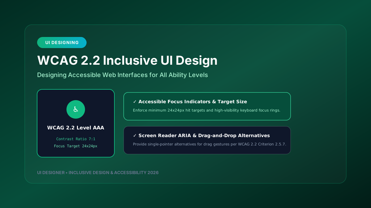
Web wcag-2026" class="internal-link">accessibility is no longer just a compliance requirement—it is a cornerstone of modern digital product design. Building inclusive software ensures that individuals with visual, auditory, motor, or cognitive impairments can navigate, understand, and interact with web applications effectively.
This engineering guide explores practical implementation strategies for **WCAG 2.2 (Web Content wcag-2026" class="internal-link">Accessibility Guidelines)** standards across design systems and production codebases.
---
1. What’s New in WCAG 2.2?
WCAG 2.2 builds upon previous standards by introducing critical criteria specifically focused on cognitive wcag-2026" class="internal-link">accessibility, mobile touch target sizes, and wcag-2026" class="internal-link">accessibility-checklist-wcag-2026" class="internal-link">keyboard navigation visibility.
┌─────────────────────────────────────────────────────────────────────────────┐
│                       WCAG 2.2 CRITICAL CRITERIA                            │
├─────────────────────────────────────────────────────────────────────────────┤
│                                                                             │
│  1. TARGET SIZE (MINIMUM) (2.5.8 Level AA) ─► Minimum 24x24px hit target   │
│  2. FOCUS APPEARANCE (2.4.13 Level AAA) ────► Enforce high-contrast rings   │
│  3. DRAGGING MOVEMENTS (2.5.7 Level AA) ────► Single-pointer alternatives    │
│  4. REDUNDANT ENTRY (3.3.7 Level A) ────────► Prevent re-typing user data   │
│                                                                             │
└─────────────────────────────────────────────────────────────────────────────┘
---
2. Designing Accessible Focus States & Color Contrast
A common flaw in modern websites is removing default browser focus outlines (`outline: none`) without providing custom high-visibility focus states.
Accessible CSS Focus Ring Pattern:
/* High-Contrast Accessible Focus Ring */
:focus-visible {
  outline: 3px solid #10b981;
  outline-offset: 3px;
  box-shadow: 0 0 0 5px rgba(16, 185, 129, 0.3);
}
/* Accessible Color wcag-2026" class="internal-link">Contrast Tokens */ :root { --text-high-wcag-2026" class="internal-link">contrast: #0f172a; /* Ratio 14.5:1 against white */ --bg-primary: #ffffff; --action-accessible: #047857; /* Ratio 4.8:1 against white */ }
---
3. ARIA Roles & Screen Reader Compatibility
Accessible UI components must expose semantic HTML elements and appropriate WAI-ARIA attributes to assistive technologies.
Accessible Modal Dialog Example (React):
import React, { useEffect, useRef } from 'react';export const AccessibleModal: React.FC<{ isOpen: boolean; onClose: () => void; title: string; children: React.ReactNode }> = ({ isOpen, onClose, title, children, }) => { const modalRef = useRef
useEffect(() => { if (isOpen) { modalRef.current?.focus(); } }, [isOpen]);
if (!isOpen) return null;
return (
{title}
---
4. Automated Accessibility Testing in CI/CD
Prevent wcag-2026" class="internal-link">accessibility regressions by integrating `@axe-core/cli` or Playwright wcag-2026" class="internal-link">accessibility assertions into continuous integration pipelines.
// Playwright Accessibility Test
import { test, expect } from '@playwright/test';
import AxeBuilder from '@axe-core/playwright';
test('Homepage should have zero WCAG 2.2 AA violations', async ({ page }) => { await page.goto('https://ui-designer.in');
const accessibilityScanResults = await new AxeBuilder({ page }) .withTags(['wcag2a', 'wcag2aa', 'wcag22aa']) .analyze();
expect(accessibilityScanResults.violations).toEqual([]); });
Designing for wcag-2026" class="internal-link">accessibility guarantees a better, more robust user experience for every single user on the web.