

You've launched the website. Traffic is coming in. But conversions? Flat. The problem isn't traffic — it's that your website doesn't speak to the human on the other side of the screen.
Conversion-centered design isn't about dark patterns or aggressive popups. It's about clarity, trust, and reducing the cognitive load between "I have a problem" and "This is the solution."
This is the framework we use at UI Designer to design websites that convert — not just look good in Figma.
The Conversion Equation
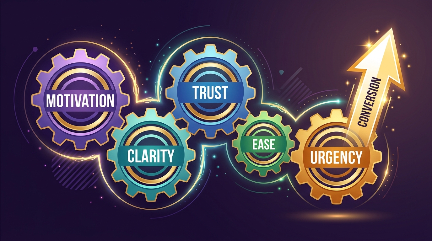
Conversion = Motivation × Clarity × Trust × Ease × Urgency
                ↑          ↑        ↑      ↑        ↑
             Value prop  UX/UI   Social  Friction  Timing
             Messaging   Flow    Proof   Removal   Triggers
If any factor is zero, conversion is zero. Most sites fail on **Clarity** and **Trust**.
---
Phase 1: Clarity — The 5-Second Test
1. The Hero Formula (Above the Fold)
Every homepage/landing page must answer three questions in 5 seconds:
| Question | Element | Example | |----------|---------|---------| | **What is this?** | Headline (H1) | "Automated Invoice Processing for Finance Teams" | | **Who is it for?** | Sub-headline | "Cut manual data entry by 90% — no templates, no training" | | **What do I do next?** | Primary CTA | "Start Free Trial" / "See Live Demo" |
**Template:**
[Headline: Outcome + Target Audience]
[Sub-headline: Mechanism + Quantified Benefit + Differentiator]
[Primary CTA: Action Verb + Low-Friction Commitment]
[Trust Signal: Logos / Numbers / Rating]
**Bad:** "Welcome to Acme Corp — Innovative Solutions Since 1999" **Good:** "Close Your Books 5x Faster — AI-Powered Reconciliation for Mid-Market Finance Teams"
2. Value Proposition Canvas
Before designing, fill this for every key page:
| Customer Job | Pain Points | Gain Creators | Your Feature | |--------------|-------------|---------------|--------------| | "Reconcile 500 invoices/month" | Manual entry errors, 20hrs/month | 90% time saved, <1% error rate | AI extraction + auto-match | | "Approve vendor payments" | No visibility, late fees | Real-time dashboard, alerts | Approval workflow + Slack integration |
**Every section on the page maps to a row.** No orphan content.
3. Message Hierarchy (Not Visual Hierarchy)
Design the *message* first, then the visual.
H1: Primary Promise (Outcome)
  H2: How It Works (Mechanism) — 3 steps max
    H3: Feature → Benefit → Proof
  H2: Social Proof (Trust)
    Testimonial + Logo + Result
  H2: Objection Handling (FAQ)
    "What about security?" → SOC 2 + encryption
  H2: Final CTA (Urgency)
    "Join 2,000+ finance teams"
---
Phase 2: Trust — The Credibility Stack
Trust isn't a badge. It's a **stack of evidence** throughout the page.
4. The Trust Stack (Order Matters)
Level 1: Authority Signals (Instant credibility)
  ☐ Recognizable client logos (not just "trusted by")
  ☐ Industry certifications (SOC 2, ISO, HIPAA)
  ☐ Media mentions (TechCrunch, industry pubs)
  ☐ Investor/accelerator logos (YC, Sequoia, etc.)
Level 2: Social Proof (Peer validation) ☐ Video testimonials (name, title, company, face) ☐ Case studies with metrics ("Reduced close time from 14→3 days") ☐ Review ratings (G2, Capterra, TrustRadius) — embed widgets ☐ User count / data volume ("Processing $2B/month")
Level 3: Transparency Signals (Risk reduction) ☐ Pricing page (public, no "contact us" for standard plans) ☐ Security page (penetration tests, compliance, data centers) ☐ Team page (real photos, LinkedIn links) ☐ Public roadmap / changelog
Level 4: Risk Reversal (Remove fear) ☐ Free trial (no credit card) ☐ Money-back guarantee (30/60/90 days) ☐ Pilot program / sandbox environment ☐ SLA + support response times
**Place conversion-centered-design-framework-2026" class="internal-link">trust signals at decision points:** Next to CTA, in pricing, in FAQ, at bottom of long pages.
5. Case Study Template (That Actually Converts)
[Client Logo] + [Headline: Specific Result]
"Company X reduced Y by Z% in [timeframe]"
Challenge: 2-3 sentences, their words Solution: What you did (not features — outcomes) Results: • Metric 1: Before → After • Metric 2: Before → After • Qualitative win: "Team now focuses on strategy, not data entry" Quote: "Best decision we made this year" — Name, Title CTA: "See how [Company X] did it" → Full case study page
---
Phase 3: Ease — Friction Audit
Every click, field, decision, and wait is friction. Audit ruthlessly.
6. Form Optimization Checklist
| Element | Standard | High-Converting | |---------|----------|-----------------| | Fields | 7-10 | 3-5 (progressive profiling) | | Labels | Placeholder only | Above field, always visible | | Validation | On submit | Inline on blur + success state | | Error message | "Invalid input" | "Email format: name@company.com" | | Autocomplete | None | Full `autocomplete` attributes | | Mobile keyboard | Default | `type="email"`, `tel`, `url` | | Submit button | "Submit" | "Start Free Trial" (value-oriented) | | reCAPTCHA | v2 checkbox | Invisible v3 / Turnstile / Honeypot |
**Progressive Profiling:** Ask for email first. Enrich later via Clearbit, or ask 1 question per return visit.
7. Navigation & Flow Friction
- **One primary CTA per screen** — secondary actions are links, not buttons
- **Sticky CTA** on mobile (bottom bar: "Get Started")
- **Back button works** — no "flow broken" on browser back
- **Deep links work** — email CTA → specific page, not homepage
- **Loading states** — skeleton screens, not spinners
- **Empty states** — "No data yet. Here's how to add your first project." + CTA
8. Cognitive Load Reduction
- **Chunk information** — 3-4 items per group (Miller's Law)
- **Visual hierarchy** — One thing pops; rest supports
- **Default to smart choices** — Pre-select most popular plan, auto-detect country
- **Progressive disclosure** — "Show more" for specs, FAQ accordions
- **Comparison tables** — For pricing, features, plans (reduce mental math)
---
Phase 4: Urgency & Timing — Ethical Nudges
9. Genuine Urgency (Not Fake Countdowns)
| Type | Implementation | Ethics | |------|----------------|--------| | **Capacity** | "Only 3 pilot spots this month" | Real limit | | **Price lock** | "Current pricing ends [date]" | Real change | | **Bonus** | "Free onboarding ($2,000 value) this week" | Real deadline | | **Event** | "Join live demo Thursday 2pm EST" | Real event | | **Seasonal** | "Year-end close? Start now, be ready by Dec 15" | Real timeline |
**Never:** Fake "10 people viewing," arbitrary countdown timers, "only 1 left" (unless true).
10. Micro-Conversions (The Path to Macro)
Not everyone buys today. Capture intent at every stage:
| Stage | Micro-Conversion | Tool | |-------|------------------|------| | Awareness | Newsletter signup | Lead magnet (guide, template, calculator) | | Consideration | Demo request / Trial start | Calendly embed / Self-serve signup | | Evaluation | Pricing page view | Track + retarget | | Intent | Contact sales / Chat | Drift / Intercom / Calendly | | Purchase | Contract signed | DocuSign / PandaDoc |
**Nurture each micro-conversion** with relevant email sequence.
---
Phase 5: Page-Type Playbooks
11. Homepage (The Traffic Hub)
- Hero: Promise + CTA + Trust logos
- Problem/Solution: "You're here because..." → "Here's how we fix it"
- How It Works: 3-step visual flow
- Social Proof: 3 testimonials + logo strip
- Feature Highlights: 3-4 cards (outcome-focused)
- Pricing Teaser: "Starting at $X/mo" → Pricing page
- Final CTA: "Join [number] teams" + Low-friction entry
12. Landing Page (Campaign-Specific)
- Hero: Match ad/email message exactly (message match)
- Single Offer: One promise, one CTA
- Benefits > Features: "Save 10hrs/week" not "AI engine"
- Proof: 1 strong case study or 3 testimonials
- FAQ: Top 5 objections
- CTA: Repeated 3x (top, middle, bottom)
- No navigation (or minimal) — reduce leaks
13. Product/Feature Page (SEO + Conversion)
- Hero: H1 = [Feature] for [Persona] — SEO + Clarity
- Demo/Video: 60-90s, problem → solution → result
- Key Benefits: 3-4 with icons + 1-sentence outcome
- How It Works: Screenshots/GIFs + captions
- Integrations: Logos + "Works with your stack"
- Specs Table: For technical buyers
- Compare: "vs. [Alternative]" table (honest)
- CTA: Trial/Demo + "Not ready? Get the guide"
14. Pricing Page (The Closest to Revenue)
- Header: "Simple, transparent pricing"
- Toggle: Monthly/Annual (annual default, shows savings)
- 3 Plans Max: Starter / Growth / Enterprise
- Each Plan: Price + Outcome headline + 5-7 bullets + CTA
- FAQ: "What's included?" "Cancel anytime?" "Data export?"
- Money-back guarantee badge
- Enterprise: "Contact sales" — not a plan, a conversation
- Comparison table (toggle) for feature nerds
15. Contact/Lead Gen Page
- Hero: "Let's solve [problem] together"
- Form: 4 fields max (Name, Email, Company, Message)
- Alternative CTAs: "Book 15-min call" (Calendly) / "Chat now"
- What happens next: "We'll respond in 2 hours" + process steps
- Trust: Client logos + "We don't spam"
- Office hours / Response time commitment
---
Measurement: What to Track (Not Vanity)
| Metric | Formula | Target | Tool | |--------|---------|--------|------| | **Conversion Rate** | Conversions / Sessions | >3% (B2B), >2% (SaaS) | GA4, Mixpanel | | **Form Completion Rate** | Submissions / Form views | >60% | GA4 + Form analytics | | **CTA Click-Through** | Clicks / Impressions | >5% primary | Hotjar, GA4 events | | **Scroll Depth** | % reaching key sections | >50% to pricing | Hotjar, Scroll depth | | **Time to Convert** | First visit → Conversion | <7 days (B2B) | Mixpanel, Amplitude | | **Micro-Conversion Rate** | Newsletter/Demo/Trial per session | Track each | GA4 events | | **Drop-off Points** | Funnel visualization | Identify top 3 | GA4 Funnel, Mixpanel |
**Set up:** GA4 Enhanced Measurement + Custom Events for every CTA, form step, scroll milestone.
---
A/B Test Roadmap (Prioritized by Impact)
| Test | Hypothesis | Effort | Expected Lift | |------|------------|--------|---------------| | Hero headline: Outcome vs Feature | Outcome-focused wins | Low | +10-20% | | CTA copy: "Get Started" vs "Start Free Trial" | Value-oriented wins | Low | +5-15% | | Form fields: 7 vs 4 (progressive) | Fewer fields = more submits | Medium | +15-30% | | Social proof: Logos vs Testimonials | Testimonials > logos | Low | +5-10% | | Pricing: Monthly default vs Annual default | Annual = higher LTV | Low | +20% ARPU | | Demo request: Calendar embed vs Form | Embed = less friction | Medium | +25% bookings | | Trust badge placement: Hero vs Pricing | Near decision point wins | Low | +3-8% | | Video demo: Autoplay muted vs Click-to-play | Autoplay = more views | Low | +15% video plays |
**Run one test at a time. Minimum 2 weeks. 95% statistical significance. Document learnings.**
---
The Conversion-Centered Design Process
Week 1: Research & Strategy
- [ ] Stakeholder interviews (sales, support, customers)
- [ ] Analytics audit (drop-offs, high-exit pages)
- [ ] Competitor tear-down (messaging, flow, trust)
- [ ] User testing (5 users, current site)
- [ ] Define value props + messaging hierarchy
Week 2: Wireframes & Copy
- [ ] Low-fidelity wireframes (mobile-first)
- [ ] Copywriting: Headlines, benefits, objections, CTAs
- [ ] Stakeholder review (copy + structure)
- [ ] User test wireframes (5 users, task-based)
Week 3: High-Fidelity Design
- [ ] Design system application (tokens, components)
- [ ] All breakpoints (360, 768, 1440)
- [ ] Interaction states (hover, focus, loading, error)
- [ ] Design QA checklist
Week 4: Development & QA
- [ ] Build in Next.js/Astro (Server Components)
- [ ] Form validation (React Hook Form + Zod)
- [ ] Analytics events implemented
- [ ] Accessibility audit (WCAG 2.2 AA)
- [ ] Performance budget (LCP <2.5s, CLS <0.1)
Week 5: Launch & Optimize
- [ ] Staged rollout (10% → 50% → 100%)
- [ ] Monitor Core Web Vitals + conversion funnel
- [ ] First A/B test live
- [ ] Weekly review: data → hypothesis → test
---
Common Conversion Killers (Fix These First)
| Killer | Symptom | Fix | |--------|---------|-----| | **Unclear headline** | High bounce, low scroll | Rewrite: Outcome + Audience | | **Weak CTA** | Low click-through | Verb + Value ("Get Free Audit") | | **No conversion-centered-design-framework-2026" class="internal-link">trust signals** | High exit at pricing | Add logos, testimonials, guarantees | | **Form friction** | High form abandonment | Cut fields, inline validation | | **Slow mobile** | Mobile CVR << Desktop | LCP <2.5s, sticky CTA | | **Message mismatch** | Ad → Page disconnect | Dedicated landing pages | | **No micro-conversions** | All-or-nothing | Lead magnets, newsletter, tools | | **Hidden pricing** | Enterprise only? | Public pricing or "Starting at" |
---
The UI Designer Conversion Approach
We don't guess. We:
- **Audit** — Data + user testing + heuristic review
- **Strategize** — Value prop canvas + messaging hierarchy
- **Design** — Mobile-first, conversion-patterns, trust stack
- **Build** — Performant, accessible, analytics-ready
- **Optimize** — A/B testing roadmap + monthly reviews
**Recent Results:**
- **B2B SaaS**: Homepage redesign → +42% demo requests, +28% trial starts
- **Agency**: Landing page + form optimization → +65% qualified leads
- **E-commerce**: Product page + checkout → +38% conversion, +22% AOV
Ready to Convert More Visitors?
Book a **Conversion Audit** — we'll review your top 5 pages, identify the highest-impact fixes, and give you a prioritized roadmap with expected lift estimates.
ui-designer.in/conversion-audit
Frequently Asked Questions
Frequently Asked Questions
- What's the difference between conversion rate optimization (CRO) and conversion-centered design?
- CRO is the practice of improving conversions through testing. Conversion-centered design is the strategic framework for building pages that convert from the start — clarity, trust, ease, urgency baked into the design, not bolted on later.
Frequently Asked Questions
- How long does it take to see results from conversion-centered design?
- Initial improvements (fixing clarity, form friction) show in 2-4 weeks. A/B testing cycle: 2-4 weeks per test. Full funnel optimization: 3-6 months for compound gains.
Frequently Asked Questions
- Do I need to run A/B tests for every change?
- No. Fix obvious bugs (broken forms, slow mobile, unclear CTAs) without testing. Test when: multiple valid design directions exist, stakes are high (pricing page, checkout), or you need stakeholder buy-in.
Frequently Asked Questions
- What's a good conversion rate for B2B SaaS?
- Varies by funnel stage: Visitor → Trial: 2-5%, Trial → Paid: 15-25%, Visitor → Demo request: 1-3%. Benchmark against your own baseline, not industry averages.
Frequently Asked Questions
- How do I reduce form friction without losing lead quality?
- Progressive profiling — ask for email first, enrich via Clearbit, ask 1 question per return visit. Use autocomplete, inline validation, and smart defaults. Only require fields sales actually uses.
Frequently Asked Questions
- Where should I place trust signals for maximum impact?
- At decision points: next to primary CTA, in pricing section, above checkout, in FAQ. Use the 4-level trust stack: Authority → Social Proof → Transparency → Risk Reversal.
Frequently Asked Questions
- What's the most overlooked conversion lever?
- Post-purchase experience. One-click upsells (10-20% take rate), referral programs, review requests at day 3-7. Retention and expansion revenue often exceed acquisition.