

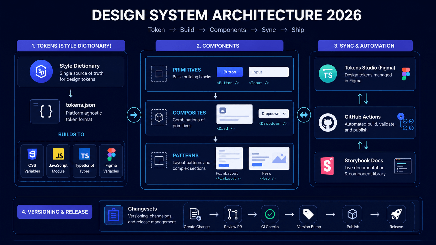
Design systems are the difference between a codebase that scales and one that becomes a graveyard of inconsistent components, duplicate CSS, and "quick fixes" that never get cleaned up.
This is the practical design system architecture we use at UI Designer — from tokens to documentation, with the exact file structure, tooling, and governance model that keeps it alive.
Why Most Design Systems Fail
| Failure Mode | Symptom | Root Cause | |--------------|---------|------------| | **Abandoned** | Figma file unused, code diverges | No ownership, no process | | **Bloated** | 50+ components, 10 used | Built for hypotheticals, not real needs | | **Inconsistent** | Button looks different everywhere | No single source of truth | | **Inaccessible** | Missing focus states, wcag-2026" class="internal-link">contrast failures | A11y bolted on, not baked in | | **Outdated** | Tokens in Figma ≠ tokens in code | No automation between design ↔ code |
**A living design system has three pillars: Tokens (source of truth), Components (implementation), Governance (process).**
---
Architecture Overview
design-system/
├── tokens/                    # Design tokens (single source of truth)
│   ├── src/                   # Token definitions (JSON/TS)
│   │   ├── color.json
│   │   ├── spacing.json
│   │   ├── typography.json
│   │   ├── border-radius.json
│   │   ├── shadows.json
│   │   ├── motion.json
│   │   ├── breakpoints.json
│   │   └── z-index.json
│   ├── build/                 # Build scripts (Style Dictionary)
│   │   ├── config.js
│   │   ├── platforms/         # CSS, JS, iOS, Android, Figma
│   │   └── transforms/        # Custom transforms
│   └── package.json
├── components/                # React component library
│   ├── src/
│   │   ├── primitives/        # Atoms: Button, Input, Badge, Avatar
│   │   ├── composites/        # Molecules: Card, Dropdown, Tabs
│   │   ├── patterns/          # Organisms: FormLayout, DataTable, Modal
│   │   ├── hooks/             # useTheme, useMediaQuery, useTokens
│   │   ├── utils/             # cn(), token helpers
│   │   └── index.ts           # Public API
│   ├── stories/               # Storybook stories
│   ├── tests/                 # Vitest + RTL + a11y
│   ├── package.json
│   └── tsconfig.json
├── docs/                      # Documentation site (Astro/Next.js)
│   ├── src/
│   │   ├── pages/             # Getting started, components, tokens
│   │   ├── components/        # Doc-specific components
│   │   └── content/           # MDX content
│   └── package.json
├── figma/                     # Figma sync
│   ├── tokens/                # Tokens Studio / Figma Variables export
│   ├── components/            # Component mapping docs
│   └── sync-script.js         # CI sync validation
├── .github/
│   └── workflows/             # CI: build, test, publish, sync check
├── turbo.json                 # Turborepo config
├── package.json               # Root workspace
└── README.md
**Monorepo (Turborepo)** — Independent versioning, shared tooling, fast builds.
---
Layer 1: Design Tokens (The Source of Truth)
Token Structure (Style Dictionary Format)
// tokens/src/color.json
{
  "color": {
    "primary": {
      "50": { "value": "#eff6ff", "type": "color" },
      "100": { "value": "#dbeafe", "type": "color" },
      "500": { "value": "#3b82f6", "type": "color" },
      "600": { "value": "#2563eb", "type": "color" },
      "700": { "value": "#1d4ed8", "type": "color" },
      "900": { "value": "#1e3a8a", "type": "color" }
    },
    "neutral": {
      "50": { "value": "#fafafa", "type": "color" },
      "100": { "value": "#f5f5f5", "type": "color" },
      "900": { "value": "#171717", "type": "color" }
    },
    "semantic": {
      "background": { "value": "{color.neutral.50}", "type": "color" },
      "foreground": { "value": "{color.neutral.900}", "type": "color" },
      "border": { "value": "{color.neutral.200}", "type": "color" },
      "ring": { "value": "{color.primary.500}", "type": "color" },
      "error": { "value": "{color.red.500}", "type": "color" },
      "success": { "value": "{color.green.500}", "type": "color" }
    }
  }
}
// tokens/src/typography.json
{
"typography": {
"fontFamily": {
"sans": { "value": "Inter, system-ui, sans-serif", "type": "fontFamily" },
"mono": { "value": "JetBrains Mono, monospace", "type": "fontFamily" }
},
"fontSize": {
"xs": { "value": "0.75rem", "type": "fontSize" },
"sm": { "value": "0.875rem", "type": "fontSize" },
"base": { "value": "1rem", "type": "fontSize" },
"lg": { "value": "1.125rem", "type": "fontSize" },
"xl": { "value": "1.25rem", "type": "fontSize" },
"2xl": { "value": "1.5rem", "type": "fontSize" },
"3xl": { "value": "1.875rem", "type": "fontSize" },
"4xl": { "value": "2.25rem", "type": "fontSize" }
},
"fontWeight": {
"normal": { "value": "400", "type": "fontWeight" },
"medium": { "value": "500", "type": "fontWeight" },
"semibold": { "value": "600", "type": "fontWeight" },
"bold": { "value": "700", "type": "fontWeight" }
},
"lineHeight": {
"tight": { "value": "1.25", "type": "lineHeight" },
"normal": { "value": "1.5", "type": "lineHeight" },
"relaxed": { "value": "1.75", "type": "lineHeight" }
}
}
}Build: Style Dictionary → Multi-Platform
// tokens/build/config.js
const StyleDictionary = require('style-dictionary');
StyleDictionary.registerTransform({ name: 'css/custom-property', type: 'value', matcher: () => true, transformer: (prop) => `var(--${prop.path.join('-')})` });
const config = { source: ['src/**/*.json'], platforms: { css: { transformGroup: 'css', buildPath: 'dist/css/', files: [{ destination: 'tokens.css', format: 'css/variables', options: { outputReferences: true } }] }, js: { transformGroup: 'js', buildPath: 'dist/js/', files: [{ destination: 'tokens.js', format: 'javascript/es6', options: { outputReferences: true } }] }, ts: { transformGroup: 'js', buildPath: 'dist/ts/', files: [{ destination: 'tokens.ts', format: 'typescript/es6-declarations', options: { outputReferences: true } }] }, figma: { transformGroup: 'figma', buildPath: 'dist/figma/', files: [{ destination: 'tokens.json', format: 'figma/tokens' }] } } };
module.exports = config;
**Output (CSS):**
/* tokens/dist/css/tokens.css */
:root {
  --color-primary-50: #eff6ff;
  --color-primary-500: #3b82f6;
  --color-primary-600: #2563eb;
  --color-semantic-background: var(--color-neutral-50);
  --color-semantic-foreground: var(--color-neutral-900);
  --typography-font-size-xs: 0.75rem;
  --typography-font-size-base: 1rem;
  --spacing-4: 1rem;
  --shadow-md: 0 4px 6px -1px rgb(0 0 0 / 0.1);
}
---
Layer 2: Components (React + TypeScript + Tailwind)
Primitive: Button (Accessible, Variants, Composable)
// components/src/primitives/Button/Button.tsx
'use client';
import { forwardRef } from 'react'; import { Slot } from '@radix-ui/react-slot'; import { cva, type VariantProps } from 'class-variance-authority'; import { cn } from '../../utils/cn'; import { buttonVariants } from './button.variants';
export interface ButtonProps extends React.ButtonHTMLAttributes
export const Button = forwardRef
// components/src/primitives/Button/button.variants.ts
import { cva } from 'class-variance-authority';
export const buttonVariants = cva( 'inline-flex items-center justify-center gap-2 whitespace-nowrap rounded-md text-sm font-medium transition-colors focus-visible:outline-none focus-visible:ring-2 focus-visible:ring-ring focus-visible:ring-offset-2 disabled:pointer-events-none disabled:opacity-50', { variants: { variant: { default: 'bg-primary text-primary-foreground hover:bg-primary/90', destructive: 'bg-destructive text-destructive-foreground hover:bg-destructive/90', outline: 'border border-input bg-background hover:bg-accent hover:text-accent-foreground', secondary: 'bg-secondary text-secondary-foreground hover:bg-secondary/80', ghost: 'hover:bg-accent hover:text-accent-foreground', link: 'text-primary underline-offset-4 hover:underline', }, size: { default: 'h-10 px-4 py-2', sm: 'h-9 rounded-md px-3', lg: 'h-11 rounded-md px-8', xl: 'h-12 rounded-lg px-10 text-base', icon: 'h-10 w-10', }, }, defaultVariants: { variant: 'default', size: 'default' }, } );
Composite: Card (Composable, Accessible)
// components/src/composites/Card/Card.tsx
'use client';
import { cn } from '../../utils/cn';
const Card = forwardRef
const CardHeader = forwardRef
const CardTitle = forwardRef
const CardContent = forwardRef
export { Card, CardHeader, CardTitle, CardContent };
Pattern: FormLayout (Opinionated, Accessible Defaults)
// components/src/patterns/FormLayout/FormLayout.tsx
'use client';
import { cn } from '../../utils/cn'; import { Label } from '../../primitives/Label'; import { Input } from '../../primitives/Input'; import { Textarea } from '../../primitives/Textarea'; import { Button } from '../../primitives/Button';
interface FormFieldProps { label: string; name: string; type?: 'text' | 'email' | 'tel' | 'url' | 'password'; required?: boolean; error?: string; hint?: string; children?: React.ReactNode; // For custom inputs (Select, DatePicker) }
function FormField({ label, name, type = 'text', required, error, hint, children }: FormFieldProps) { const errorId = `${name}-error`; const hintId = `${name}-hint`;
return (
{error}
} {hint && !error &&{hint}
} ) : ( aria-invalid={!!error} aria-describedby={error ? errorId : hint ? hintId : undefined} className={error ? 'border-destructive focus:ring-destructive' : undefined} /> )}interface FormLayoutProps { fields: FormFieldProps[]; submitLabel: string; onSubmit: (data: Record
export function FormLayout({ fields, submitLabel, onSubmit, loading, secondaryAction }: FormLayoutProps) { const [formData, setFormData] = useState
const handleSubmit = (e: React.FormEvent) => { e.preventDefault(); onSubmit(formData); };
return (
); }---
Layer 3: Figma ↔ Code Sync
Tokens Studio (Figma Plugin) → Style Dictionary
- **Designers** manage tokens in Figma (Tokens Studio plugin)
- **Export** → `figma/tokens/tokens.json`
- **CI** validates sync: `npm run tokens:sync:check`
- **Build** → CSS/JS/TS outputs auto-generated
// figma/sync-script.js
const fs = require('fs');
const path = require('path');
const FIGMA_TOKENS = path.resolve(__dirname, 'tokens/tokens.json'); const CODE_TOKENS = path.resolve(__dirname, '../tokens/src');
function validateSync() { const figma = JSON.parse(fs.readFileSync(FIGMA_TOKENS, 'utf8')); const codeFiles = fs.readdirSync(CODE_TOKENS).filter(f => f.endsWith('.json'));
// Compare key token sets (color, spacing, typography) // Fail CI if drift > threshold }
validateSync();
Component Mapping Doc
| Figma Component | Code Component | Status | Notes | |-----------------|----------------|--------|-------| | Button/Primary | `Button{variant:'default'}` | ✅ Synced | | | Button/Secondary | `Button{variant:'secondary'}` | ✅ Synced | | | Input/Default | `Input` | ✅ Synced | | | Card/Elevated | `Card` | ✅ Synced | | | Modal/Default | `Dialog` | ⚠️ Gap | Figma has footer variant | | Table/Sortable | `DataTable` | ❌ Missing | Needs implementation |
**Sync checklist in PR template:**
- [ ] Tokens updated in Figma → exported
- [ ] New components have Figma counterparts
- [ ] Variant mapping documented
- [ ] Design QA passed
---
Layer 4: Documentation (Astro + Starlight / Next.js)
// docs/src/pages/components/button.mdx
---
title: Button
component: Button
category: Primitives
---
import { ComponentPreview, PropsTable } from '@/components/docs';
Button
Interactive element for actions. Built on Radix Slot for polymorphic composition.
Usage
import { Button } from '@ui-designer/components';
Variants
Props
Accessibility
- Keyboard: `Enter`/`Space` activates
- Focus: Visible ring (WCAG 2.2 AA)
- Loading: `aria-busy` + spinner announced
- Disabled: Removed from tab order
---
Governance: The Process That Keeps It Alive
1. Ownership Model
| Role | Responsibility | |------|----------------| | **Design System Owner** (1 person) | Roadmap, prioritization, breaking changes | | **Design Contributors** (2-3) | Token updates, Figma components, design QA | | **Engineering Contributors** (2-3) | Component implementation, testing, releases | | **Consumers** (all teams) | Feedback, bug reports, adoption |
2. Contribution Workflow
- Request → GitHub Issue (template: component / token / pattern)
- RFC → Lightweight design doc (1-2 pages) for new components
- Build → Branch → PR with: component, stories, tests, docs
- Review → Design QA + Code review + A11y check
- Merge → Auto-publish to npm (changesets) + Storybook deploy
- Communicate → Changelog + Slack announcement + migration guide
3. Versioning & Releases (Changesets)
# Contributor adds changeset
npx changeset
# Select: patch / minor / major
# Write summary: "Add Button loading state"
# Release (maintainer) npx changeset version # Updates versions, CHANGELOG.md git push --follow-tags npm publish --access public # Auto via CI
4. Adoption Metrics (Track Quarterly)
| Metric | Target | |--------|--------| | Component coverage | >80% of UI uses DS components | | Token usage | 100% of colors/spacing from tokens | | Breaking changes/year | <2 (major) | | redesign-checklist-50-steps" class="internal-link">Migration time | <1 day for consumers | | wcag-2026" class="internal-link">Accessibility regressions | 0 |
---
Tooling Stack (2026)
| Purpose | Tool | Why | |---------|------|-----| | **Tokens** | Style Dictionary | Multi-platform, mature, extensible | | **Figma Sync** | Tokens Studio | Variables support, two-way sync | | **Components** | React + TypeScript + Tailwind | Type-safe, utility-first, no runtime | | **Variants** | class-variance-authority (CVA) | Type-safe variants, no CSS-in-JS | | **Primitives** | Radix UI / cms-comparison-wordpress-sanity-strapi-2026" class="internal-link">Headless UI | Accessible, unstyled, composable | | **Documentation** | Astro Starlight / Next.js | Fast, MDX, component previews | | **Storybook** | Storybook 8 + Vite | Component development, visual testing | | **Testing** | Vitest + RTL + axe-core | Fast, accessible, CI-friendly | | **testing-strategies-2026" class="internal-link">Visual Regression** | Chromatic / Percy | Catch visual bugs | | **Monorepo** | Turborepo | Fast builds, caching, independent versions | | **Publishing** | Changesets + npm | Automated versioning, changelogs | | **CI** | GitHub Actions | Lint, typecheck, test, build, publish |
---
Migration: Adopting in Existing Codebase
Phase 1: Foundation (Weeks 1-2)
- [ ] Set up monorepo + tokens package
- [ ] Extract existing colors/spacing/typography → tokens
- [ ] Build CSS output → import in global CSS
- [ ] Replace hardcoded values with token references
Phase 2: Primitives (Weeks 3-6)
- [ ] Button, Input, Label, Badge, Avatar, Icon
- [ ] Storybook + a11y tests for each
- [ ] Replace existing usages (codemod where possible)
Phase 3: Composites (Weeks 7-10)
- [ ] Card, Dropdown, Tabs, Dialog, Tooltip, Toast
- [ ] FormLayout, Table, Navigation components
- [ ] Document patterns (when to use which)
Phase 4: Governance (Ongoing)
- [ ] Figma sync established
- [ ] Contribution process documented
- [ ] Team training sessions
- [ ] Quarterly audit + roadmap review
---
The UI Designer Design System Package
We deliver a **production-ready design system** tailored to your brand:
- **Tokens**: Color, spacing, typography, motion, shadows — synced Figma ↔ Code
- **40+ Components**: Primitives → Composites → Patterns (all accessible, tested)
- **Documentation**: Live site with playground, props tables, accessibility notes
- **Tooling**: Turborepo, Changesets, Storybook, CI/CD, Visual regression
- **Governance**: Contribution model, versioning, migration guides, team training
- **Handoff**: 2-week onboarding for your team
**Investment:** ₹15-25L | **Timeline:** 8-12 weeks | **ROI:** 40-60% faster UI development, zero design drift
Start Building Consistent UI
Book a free design system assessment — we'll audit your current UI, identify the highest-leverage components to build first, and give you a phased roadmap.
ui-designer.in/design-system
Frequently Asked Questions
Frequently Asked Questions
- How long does it take to build a design system from scratch?
- 8-12 weeks for a production-ready system with 40+ components, tokens, documentation, and governance. Phase 1 (tokens + primitives): 4-6 weeks. Phase 2 (composites + patterns): 4-6 weeks. Ongoing governance is permanent.
Frequently Asked Questions
- Do I need a monorepo for a design system?
- Highly recommended. Turborepo/Nx gives you independent versioning, shared tooling, fast builds, and clear boundaries between tokens, components, and docs. Single-repo with folders works for small teams but scales poorly.
Frequently Asked Questions
- Should designers write code for the design system?
- Designers should own tokens in Figma (Tokens Studio) and component specs. Engineers implement components. The sync (Figma ↔ Code) should be automated. Designers reviewing PRs in Storybook is ideal — they shouldn't write production React code.
Frequently Asked Questions
- How do I handle breaking changes in a design system?
- Semantic versioning + Changesets. Major version = breaking changes with migration guide. Deprecate in minor, remove in major. Provide codemods for common migrations. Communicate 3 months ahead. Never break without a migration path.
Frequently Asked Questions
- What's the minimum viable design system?
- Tokens (color, spacing, typography) + 8 primitives (Button, Input, Label, Badge, Avatar, Icon, Tooltip, Card) + documentation. This covers 80% of UI needs. Build composites only when patterns repeat 3+ times.
Frequently Asked Questions
- How do I measure design system adoption?
- Track: % of UI using DS components (target >80%), token usage in CSS (target 100%), breaking changes/year (<2 major), migration time for consumers (<1 day), accessibility regressions (0). Automate with stylelint + custom scripts.
Frequently Asked Questions
- Should the design system be a separate npm package?
- Yes, for multi-app organizations. Publish to private npm registry. Apps consume `@your-org/design-tokens` and `@your-org/ui-components`. For single-app, a local `packages/` folder in monorepo works fine.