

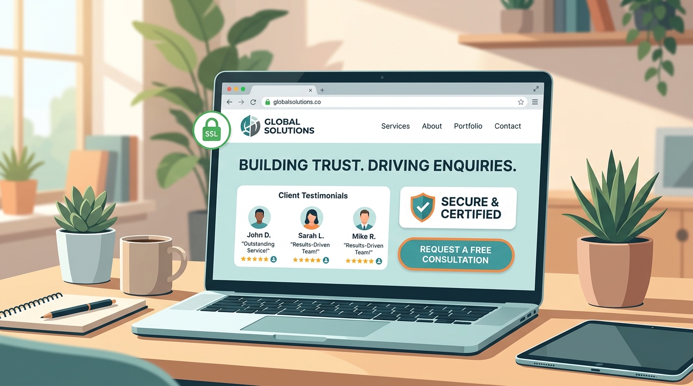
A Website Is a Business Conversation
For many people, your website is the first real interaction they have with your business. They may have found you through a search, a referral, a social post or a link shared by a colleague. Before they speak to you, they are quietly answering a few important questions: What does this business do? Is it credible? Is it right for me? What should I do next?
A strong website answers those questions without making a visitor work for the answers. That is the difference between a page that merely occupies space online and a website that supports real business growth.
At UI Designer, we treat website design as a blend of business clarity, user experience and dependable frontend engineering. The visual layer matters, but it is only one part of the outcome. A useful site makes it easier for the right people to understand your offer, evaluate it with confidence and begin a conversation.
Start With a Clear Value Proposition
The top of a homepage has a demanding job. In a few seconds, a new visitor should understand what you offer, who it is for and why it matters. Generic statements such as "we deliver excellence" rarely create that clarity. A specific message does.
For example, a service business can lead with the service it provides and the result a customer receives. A product company can lead with the problem it removes. An agency can lead with the kind of work it helps clients achieve. The wording does not have to be clever; it has to be immediately understandable.
Supporting copy can add useful detail, but the primary message should remain focused. A visitor who understands the value quickly is far more likely to keep reading, explore your work or complete an enquiry form.
Design for the Visitor's Next Decision
Every section on a website should help a visitor make their next decision. After the opening message, people often want proof. They may look for examples of work, service details, testimonials, practical information, pricing guidance or a way to contact you.
This is why structure matters. A thoughtful page moves from promise to proof to action. It uses headings that can be scanned, images that support the story and calls to action that describe a meaningful outcome. "Get a project quote" is usually more helpful than "Click here" because it tells the visitor what happens next.
Good navigation works the same way. It does not try to show everything at once. It gives people a clear route to the pages and sections they need, whether that is your portfolio, capabilities, process, articles or contact form.
Trust Is Built Through Detail
Trust is rarely created by a single element. It grows through many small signals working together: accurate copy, consistent spacing, real project work, professional photography or imagery, clear contact information, responsive layouts and pages that load without frustration.
Proof is especially important for service businesses. A portfolio should show the kind of problems you have helped solve, not simply a collection of attractive screenshots. Testimonials become stronger when they are specific. Process content becomes more useful when it tells a client what to expect after they get in touch.
Technical quality is also a trust signal. Broken links, unreadable mobile layouts and slow pages make people question the care behind a business. A site that is fast, accessible and stable sends the opposite message: this team is attentive and reliable.
Make Mobile the Baseline
Many first visits now happen on a phone. A desktop-first site that merely shrinks for mobile often leaves visitors with tiny text, difficult menus and forms that feel like work.
A mobile-ready experience gives content room to breathe, keeps tap targets comfortable and makes important actions easy to find. It also prioritises what matters. When space is limited, the strongest message, the most useful proof and the clearest conversion-centered-design-framework-2026" class="internal-link">call to action should remain visible.
Responsive design is not a final checklist item. It should shape the content hierarchy and interaction choices from the beginning.
Turn Interest Into a Simple Next Step
A visitor does not need ten competing calls to action. They need a clear path that matches their stage of decision. Someone who is ready may want to submit project requirements. Someone earlier in the process may want to browse work, understand the process or read an article.
The key is reducing friction. Forms should ask only for information you genuinely need. Buttons should make the outcome clear. Reassuring details, such as an expected response time or what happens after submission, make a first contact feel less uncertain.
Build a Website That Can Keep Improving
The best websites are not treated as one-time design projects. They are living business tools. Analytics, user questions, enquiry quality and performance data all reveal where the experience can improve.
A page with a high exit rate may need a clearer message. A form with low completion may ask for too much. A service page that attracts the wrong audience may need more specific language. Regular improvement turns website design into a practical advantage rather than a static brochure.
At UI Designer, we build websites to be clear, responsive and ready to evolve. The goal is simple: create an experience that represents your business well and helps the right people take the next step.