

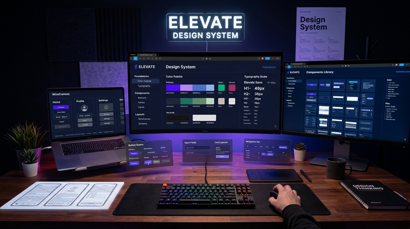
Great design does not happen by accident, nor does it survive at scale through good intentions alone. As digital products grow in scope and feature density, visual inconsistencies, design debt, and wcag-2026" class="internal-link">accessibility regressions inevitably creep in. A button has four different shades of blue across five pages; typography sizes jump haphazardly between breakpoints; modal dialogs behave unpredictably; and developers waste countless hours reinventing wheels that other team members designed six months earlier.
The solution is not more style guides trapped in static PDF documents. The solution is a living, systematic design engine: a modern Design System.
In 2026, design systems have matured far beyond component sticker sheets in Figma. They represent a shared source of truth uniting product designers, UX researchers, frontend engineers, and brand strategists through codified tokens, accessible primitives, and predictive interaction patterns. At UI Designer, crafting scalable design systems is at the heart of how we help brands launch consistent, high-converting digital experiences. Here is our strategic playbook for designing interfaces that look stunning, convert visitors, and scale effortlessly.
The Three-Tier Design Token Architecture
Design tokens are the fundamental atoms of your visual design system. They store design decisions—colors, font weights, line heights, border radii, elevation shadows, and transition timings—in platform-agnostic formats (JSON/YAML) that transform automatically into CSS custom properties, iOS Swift constants, and Android XML resources.
To build a token architecture that accommodates dark modes, high-wcag-2026" class="internal-link">contrast wcag-2026" class="internal-link">accessibility themes, and multi-brand sub-products without falling apart, we implement a strict three-tier token hierarchy:
- Primitive (Global) Tokens: The raw, immutable palette of values. Examples: `color-blue-500: #3b82f6`, `spacing-16: 1rem`, `radius-lg: 0.75rem`. These describe what exists in your toolbelt, but attach no semantic meaning or intent.
- Semantic (Alias) Tokens: Values mapped to specific roles and functional meanings within the interface. Examples: `color-surface-elevated: var(--color-slate-900)`, `color-text-primary: var(--color-slate-100)`, `color-action-interactive: var(--color-blue-600)`. Semantic tokens decouple UI intention from raw hex values. Switching between Light and Dark themes requires changing only semantic token aliases, leaving component styles 100% untouched.
- Component-Specific Tokens: Scoped variables applied strictly to a dedicated component's structural properties. Examples: `button-primary-bg: var(--color-action-interactive)`, `input-border-focus: var(--color-brand-accent)`. Component tokens allow granular customization and A/B testing without leaking side effects into other areas of the system.
Fluid Typography and Responsive Spatial Math
Designing separate, static font scales for mobile, tablet, and desktop viewports is an outdated methodology that causes visual jarring at intermediate screen dimensions. Modern design systems employ mobile-first-design-strategy-2026" class="internal-link">fluid typography and spatial scaling driven by CSS mathematical functions:
Using `clamp(min, preferred, max)` formulas, headings and body copy scale smoothly and continuously with the viewport width:
:root {
  --font-size-hero: clamp(2.5rem, 5vw + 1rem, 4.75rem);
  --font-size-h1: clamp(2rem, 3.5vw + 0.75rem, 3.25rem);
  --font-size-body: clamp(1rem, 0.5vw + 0.875rem, 1.125rem);
  --space-gutter: clamp(1rem, 3vw, 2.5rem);
}
This fluid mathematical foundation eliminates harsh breakpoint jumps, ensures editorial rhythm across folding screens and ultrawide monitors alike, and drastically reduces the number of media query overrides required in production stylesheets.
Accessibility First: Beyond WCAG 2.2 to APCA Contrast
Visual polish is meaningless if people cannot read or interact with your product. In 2026, web wcag-2026" class="internal-link">accessibility is not a compliance checklist you audit the week before launch; it is an intrinsic design criteria embedded in every token selection:
- Accessible Perceptual Contrast Algorithm (APCA): While traditional WCAG 2.1 AA/AAA relied on simple color luminance math that frequently produced false positives (such as dark text on orange buttons), modern design systems utilize APCA calculations. APCA accounts for spatial frequency, font weight, background illumination, and human cone photoreceptor physics to ensure effortless readability for all users.
- Focus Rings with Visual Distinction: Removing focus outlines to make a page look "clean" is a severe UX anti-pattern. Instead, design high-contrast, offset focus rings (`outline: 2px solid var(--focus-ring); outline-offset: 3px;`) that look intentional, polished, and assist keyboard navigators.
- Target Sizes for Touch Interfaces: Every interactive touch target must meet or exceed 44x44 CSS pixels with generous padding, preventing accidental mis-taps on mobile devices.
Micro-Interactions: Elevating Utility to Delight
Micro-interactions are the subtle feedback loops that communicate status, reassure user decisions, and infuse an interface with character. When a user clicks a button, hover-previews a card, or toggles an option, the UI should feel alive:
- Intentional Timing Curves: Avoid generic `ease` or `linear` transitions. High-end design systems utilize custom cubic-bezier curves (e.g., `cubic-bezier(0.16, 1, 0.3, 1)`) that mimic physical inertia, snappy spring movements, and tactile response.
- State Transitions: Buttons should smoothly transition through default, hover, active, loading spinner, and success checkmark states without shifting surrounding layout geometry.
- Reduced Motion Empathy: Always respect the `prefers-reduced-motion: reduce` media query. For users with vestibular disorders, swap sliding and zooming animations for gentle opacity fades, preserving context without inducing physical discomfort.
Bridging the Figma-to-Code Divide
A design system only succeeds if developers actually use it. The gap between design files and production code has historically been a graveyard of good ideas. In modern workflows, design tokens in Figma are synced directly to code repositories via automated GitHub Actions:
When a designer modifies a token value or adds a semantic color in Figma, an automated pipeline exports JSON tokens, runs linting checks for wcag-2026" class="internal-link">contrast compliance, compiles them into CSS variables, and opens a pull request. This continuous integration of design decisions bridges the communication barrier and ensures that what is designed in Figma matches what ships in the browser on day one.
Summary Checklist for Modern UI/UX Excellence
- [ ] Multi-tier design token architecture separating primitives from semantic aliases.
- [ ] Dark and light themes implemented strictly through CSS custom properties.
- [ ] Continuous fluid typography and spatial scaling using mathematical clamp formulas.
- [ ] Contrast ratios verified with modern perceptual algorithms across all component states.
- [ ] Keyboard navigation and visible focus rings designed as primary UI elements.
- [ ] Micro-interactions calibrated with organic easing curves and reduced-motion fallbacks.
- [ ] Automated token synchronization pipeline connecting Figma to production stylesheets.