

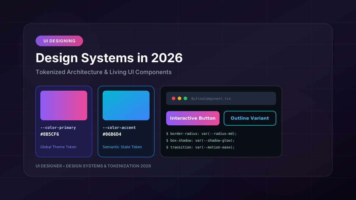
Design systems are the operational backbone of modern digital product engineering. However, far too many enterprise engineering and design teams still treat design systems as static Figma UI kits or disconnected CSS stylesheets that drift apart over time. In 2026, leading software organizations rely on **Tokenized Living Design Systems** to maintain visual integrity, accelerate feature delivery, and eliminate friction across web, mobile, and embedded application platforms.
This comprehensive architectural guide covers the practical, end-to-end implementation of tokenized design systems—from token taxonomy and Style Dictionary pipelines to Figma sync, TypeScript typing, and long-term governance.
---
1. What Are Design Tokens?
Design tokens are platform-agnostic design decisions encoded as structured data (JSON, YAML, or TypeScript). Instead of hardcoding hex colors, pixel dimensions, or font stacks directly into component stylesheets, software teams reference semantic variables that resolve dynamically based on context.
{
  "color": {
    "brand": {
      "primary": { "value": "#8B5CF6", "type": "color" }
    },
    "semantic": {
      "interactive": { "value": "{color.brand.primary}", "type": "color" }
    }
  }
}
Why Tokens Outperform Generic CSS Variables:
- **Variables are implementation details**: Native CSS custom properties or Sass `$vars` are constrained to web browsers.
- **Tokens are platform-agnostic design data**: A single token definition compiles automatically into CSS custom properties for Web, Swift variables for iOS, Jetpack Compose colors for Android, and JSON specs for Figma.
---
2. The 3-Tier Token Architecture
A robust token architecture separates raw visual values from context and component implementation.
┌─────────────────────────────────────────────────────────────────────────────┐
│                          DESIGN TOKEN ARCHITECTURE                           │
├─────────────────────────────────────────────────────────────────────────────┤
│                                                                             │
│  1. GLOBAL TOKENS (Primitive Values)                                        │
│     • color.purple.500: #8B5CF6                                             │
│     • space.16: 16px                                                        │
│     • font.family.sans: Inter, sans-serif                                   │
│                                                                             │
│  2. SEMANTIC TOKENS (Contextual Aliases)                                    │
│     • color.surface.background: {color.purple.500}                          │
│     • space.card.padding: {space.16}                                        │
│     • color.interactive.hover: {color.purple.600}                           │
│                                                                             │
│  3. COMPONENT TOKENS (Scoped Component Overrides)                            │
│     • button.primary.bg: {color.surface.background}                         │
│     • card.container.padding: {space.card.padding}                          │
│                                                                             │
└─────────────────────────────────────────────────────────────────────────────┘
Tier Breakdown:
- **Global Tokens (Option Tokens)**: Primitive values with zero semantic context (`color-cyan-400: #06B6D4`, `radius-md: 8px`).
- **Semantic Tokens (Alias Tokens)**: Intent and context assigned to global tokens (`color-action-primary: {color-cyan-400}`).
- **Component Tokens (Scoped Tokens)**: Specific component overrides (`button-primary-hover-border-radius: {radius-md}`).
---
3. Building an Automated Token Delivery Pipeline
By leveraging tools like **Style Dictionary** and **Tokens Studio for Figma**, any color adjustment or font update made by a designer in Figma triggers a automated Git workflow that builds and publishes updated platform packages.
┌─────────────────────────────────────────────────────────────────────────────┐
│                   AUTOMATED TOKEN GENERATION WORKFLOW                        │
├─────────────────────────────────────────────────────────────────────────────┤
│                                                                             │
│   FIGMA DESIGN SYSTEM ──► Tokens Studio Plugin                              │
│                                │ (Push Tokens JSON)                         │
│                                ▼                                            │
│   GITHUB REPOSITORY ────────► Style Dictionary Engine                       │
│                                │ (Build Transforms)                         │
│                                ├──► Web: variables.css & tokens.ts           │
│                                ├──► iOS: ColorTokens.swift                   │
│                                └──► Android: ColorTokens.kt                 │
│                                                                             │
└─────────────────────────────────────────────────────────────────────────────┘
Example Style Dictionary Config (`config.json`):
{
  "source": ["tokens/**/*.json"],
  "platforms": {
    "css": {
      "transformGroup": "css",
      "buildPath": "dist/css/",
      "files": [{
        "destination": "variables.css",
        "format": "css/variables"
      }]
    },
    "typescript": {
      "transformGroup": "js",
      "buildPath": "dist/ts/",
      "files": [{
        "destination": "index.d.ts",
        "format": "typescript/es6-declarations"
      }]
    }
  }
}
---
4. Dark Mode & Multi-Brand White-Labeling Strategy
With a tokenized architecture, implementing instant Dark Mode or supporting multiple enterprise client themes requires changing a single root CSS attribute or data theme attribute on the document body.
Theme Switching Implementation (CSS Custom Properties):
/* Light Theme Token Mapping */
:root, [data-theme="light"] {
  --color-surface-bg: #FFFFFF;
  --color-surface-text: #0F172A;
  --color-brand-primary: #8B5CF6;
}
/* Dark Theme Token Overrides */ [data-theme="dark"] { --color-surface-bg: #090D16; --color-surface-text: #F8FAFC; --color-brand-primary: #A78BFA; }
---
5. Type-Safe Token Integration in React & TypeScript
To prevent developers from accidentally using arbitrary hardcoded values, export strongly typed token helper utilities or styled components.
// Auto-generated Token Interfaces
export type SpacingToken = 'sm' | 'md' | 'lg' | 'xl';
export type ColorToken = 'primary' | 'secondary' | 'surface' | 'error';
export interface CardProps { padding?: SpacingToken; variant?: ColorToken; children: React.ReactNode; }
export const Card: React.FC
---
6. Long-Term Governance & System Maintenance
- **Version Control & SemVer**: Treat token updates like code releases. Patch versions for color adjustments, minor versions for new token additions, and major versions for token deprecations.
- **Automated Linting (Stylelint / ESLint)**: Run ESLint plugins that flag hardcoded hex codes (`#8B5CF6`) or arbitrary pixel values in component files, enforcing token usage across the codebase.
- **Living Documentation (Storybook / Nuxt Docs)**: Automatically generate interactive token swatch libraries and component specs directly from token source JSON files.
Tokenizing design decisions transforms your design system from a static file into an active, automated infrastructure that scales with your company.