

Responsive web design has been part of our vocabulary for well over a decade, yet a surprising number of websites still break the moment you rotate a phone, resize a browser window, or open them on a tablet in a coffee shop with patchy signal. The gap between responsive design in theory and responsive design that actually works in the real world is wide, and it is usually filled with half-finished breakpoints, images that never load, tap targets the size of a grain of rice, and layouts that look pixel-perfect in a design tool but fall apart on an actual device. This guide is our attempt to close that gap.
At UI Designer, a UI/UX and frontend studio based in Gurgaon serving clients around the world, we have shipped and rebuilt hundreds of responsive interfaces, and the same lessons keep surfacing. Responsive design is not a checklist you complete once; it is a discipline that touches layout, typography, images, performance, wcag-2026" class="internal-link">accessibility, and testing all at the same time. This article walks through every one of those areas with concrete numbers and modern techniques you can apply today, in 2026, using CSS that browsers already support. By the end you should have a mental model and a practical workflow that produces interfaces that feel intentional at every screen size, not just the two or three you happened to test.
What Responsive Design Really Means in 2026
When Ethan Marcotte coined the term responsive web design in 2010, it rested on three pillars: fluid grids, flexible images, and media queries. Those pillars are still standing, but the ground beneath them has shifted dramatically. In 2026 the device landscape is not a tidy set of phone, tablet, and desktop sizes. It is a continuous spectrum that includes foldables that change dimensions mid-session, ultra-wide monitors pushing 3440 pixels across, tiny smartwatch browsers, in-car displays, e-readers, and split-screen multitasking where your site might occupy a third of a tablet screen.
The old approach of designing for a handful of fixed device widths simply does not survive contact with this reality. Modern responsive design means building interfaces that respond gracefully to any viewport, any input method, any pixel density, and any network condition, without you having to enumerate every possibility in advance. It means treating the exact width of the screen as unknown and unknowable, and designing systems that adapt rather than layouts that switch.
There is also a deeper shift in what we are responding to. Early responsive design responded almost entirely to viewport width. Today we respond to far more: the size of a specific container rather than the whole window, the user's preference for light or dark themes, reduced motion settings, reduced data settings, the available color gamut, whether the primary input is touch or a mouse, and even how much vertical space the on-screen keyboard leaves behind. Responsive design in 2026 is really adaptive design in the fullest sense, and the tools to do it well are finally built into the browser.
Responsive versus adaptive versus fluid
These terms get used loosely, so it helps to be precise. A fluid layout uses relative units so elements grow and shrink smoothly with the viewport. A responsive layout adds breakpoints where the arrangement of elements changes, not just their size. An adaptive layout, in the older sense, served entirely different fixed layouts to different device classes, often detected on the server. The modern best practice blends the first two: fluid by default so everything scales smoothly, with a small number of well-chosen breakpoints where the structure genuinely needs to reflow. Pure adaptive, serving distinct fixed layouts, is now largely a legacy pattern.
Mobile-First Methodology, and Why It Still Matters
Mobile-first is one of those phrases that has been repeated so often it risks losing meaning, but the underlying idea remains the single most useful constraint in responsive design. Building mobile-first means you write your base styles for the smallest, most constrained screen, and then layer on enhancements for larger screens using min-width media queries. You are progressively adding complexity as space becomes available, rather than trying to strip a dense desktop layout down to fit a phone.
The reason this works so well is not ideological, it is practical. When you start with a 360 pixel wide canvas, you are forced to make hard decisions about what content and functionality actually matter. There is no room for six columns of navigation, three sidebars, and a carousel. The discipline of the small screen produces a clearer information hierarchy that then benefits every larger screen too. Starting from desktop and squeezing down almost always produces a mobile experience that feels like an afterthought, because it was one.
Mobile-first also aligns with how the majority of the world browses. Across most consumer sectors, mobile traffic sits somewhere between 55 and 70 percent of total sessions, and in many emerging markets it is far higher. Google's indexing has been mobile-first for years, meaning the mobile version of your site is the version that determines your search ranking. If your mobile experience is degraded, your business is degraded.
There is a subtle technical benefit as well. With min-width queries, the smallest devices, which are often the least powerful and on the slowest connections, download and parse the least CSS. They get the base styles and skip the enhancement layers entirely if the media queries do not match. Max-width, desktop-first CSS inverts this, forcing weak devices to process rules they will only override. Mobile-first is kinder to exactly the devices that need the most kindness.
Content priority before layout
A genuinely mobile-first process starts before any CSS is written. It starts with content priority: for each screen, what is the one thing the user came to do, and what is the linear order of importance for everything else. On a phone, everything ends up in a single column, so that priority order literally becomes the vertical reading order. Get this right on paper and the layout work becomes far easier, because you are arranging elements you have already ranked rather than guessing at importance while wrestling with flexbox.
Fluid Grids and Flexible Layouts
The heart of a responsive layout is a grid that flexes. In the early responsive era this meant painstakingly calculating percentages: to place a 700 pixel column inside a 960 pixel container you divided one by the other to get a percentage width. That math still works, but modern CSS has made it almost entirely unnecessary. Between flexbox, CSS grid, and intrinsic sizing functions, you can build layouts that flex naturally without hardcoding a single percentage.
The core principle is to stop thinking in fixed pixels for layout dimensions and start thinking in relationships and constraints. Instead of saying this element is 320 pixels wide, you say this element should be at least 280 pixels but grow to fill available space, and wrap to a new row when it cannot. The browser then solves the layout for every viewport width automatically, including the ones you never tested.
CSS Grid for two-dimensional layouts
CSS grid is the right tool whenever you are arranging content in both rows and columns at once, such as page-level scaffolding, card galleries, or dashboard panels. Its superpower for responsive work is the combination of repeat, auto-fit, and minmax. A single line can produce a card grid that automatically fits as many columns as will comfortably fit and reflows down to one column on a phone, with no media queries at all.
The pattern looks like this in plain terms: repeat auto-fit, with each column sized as minmax of 16rem and 1fr. That tells the browser to create as many equal columns as it can while keeping each one at least 16rem wide, and to distribute leftover space evenly. At 1280 pixels you might get four or five columns; at 375 pixels you get one. You wrote one rule and the browser handled every width in between. This intrinsic responsiveness, where the content and its minimum sizes drive the layout rather than fixed breakpoints, is one of the most powerful ideas in modern CSS.
Flexbox for one-dimensional flows
Flexbox is the right tool when you are laying out items along a single axis, a row of buttons, a navigation bar, a media object with an image beside text. Its responsive strength comes from flex-wrap combined with a flex-basis, letting a row of items wrap onto multiple lines as space runs out. Pair it with the gap property for consistent spacing that does not require margin hacks, and you have flexible components that adapt without breakpoints.
A common and elegant technique is the flexible sidebar: a content area and a sidebar that sit side by side on wide screens but stack on narrow ones, achieved purely by giving each a flex-basis and a sensible minimum, then letting them wrap when their combined minimums no longer fit. This is sometimes called the flexbox holy grail, and it removes an entire category of media queries from your stylesheet.
CSS Breakpoints and How to Choose Them
Breakpoints are where a lot of responsive design goes wrong, because teams choose them for the wrong reason. The classic mistake is to pick breakpoints that match specific popular devices: one for the iPhone, one for the iPad, one for a laptop. This is a losing game. There are hundreds of device widths in active use, they change every year, and designing to device silhouettes leaves gaping cracks between them where your layout has never been tested.
The correct approach is to let the content decide. You resize your browser slowly from narrow to wide and you watch. The moment the layout starts to look awkward, when line lengths get too long to read comfortably, when there is enough room for a second column, when a navigation menu has space to expand, that is a breakpoint. Content-driven breakpoints mean your layout looks good at every width because you chose the transition points where the design genuinely needed to change, not where a particular phone happens to be.
Sensible default ranges
While breakpoints should be content-driven, it helps to have rough anchor ranges as a starting point, and most design systems converge on something close to these:
- Small phones, roughly 320 to 480 pixels, the baseline single-column experience where every decision is space-constrained.
- Large phones and small tablets in portrait, roughly 481 to 767 pixels, where slightly more breathing room appears but single column still usually rules.
- Tablets and small laptops, roughly 768 to 1023 pixels, where two-column layouts and side-by-side content become viable.
- Laptops and desktops, roughly 1024 to 1439 pixels, the comfortable multi-column zone most desktop designs target.
- Large and ultra-wide displays, 1440 pixels and up, where you must actively constrain maximum content width so line lengths do not become unreadable.
Treat these as a conversation starter, not gospel. The number of breakpoints that is right for a project is the smallest number that makes the design work at every width. Many well-built sites need only two or three genuine breakpoints because their fluid foundations handle everything else. If you find yourself adding a breakpoint every 100 pixels to patch problems, that is a signal your underlying layout is not fluid enough.
Use relative units for breakpoints
Define breakpoints in em or rem rather than pixels. When a breakpoint is expressed in em, it scales with the user's font size preference, so someone who has bumped their default text size up for readability gets the layout change at a proportionally larger point. This is a small change that meaningfully improves the experience for users with low vision, and it costs you nothing.
Modern CSS: Flexbox, Grid, Clamp, and Container Queries
The tools available in CSS today make responsive work dramatically easier and more robust than it was even a few years ago. Four capabilities in particular deserve a place in every frontend developer's core toolkit.
The clamp function for fluid sizing
The clamp function takes three values, a minimum, a preferred, and a maximum, and returns the preferred value clamped between the other two. It is the single most useful function for responsive design because it lets one declaration replace a stack of media queries. For a heading you might write a font size that is clamped between 1.75rem at the small end and 3rem at the large end, with a preferred value that scales with the viewport width. The text then grows smoothly as the screen widens and locks at sensible limits at both extremes. No breakpoints, no jumps, just continuous, controlled scaling. The same technique works beautifully for spacing, padding, and container widths.
Container queries change everything
For most of responsive design's history, we could only respond to the size of the whole viewport. This created a real problem for reusable components. A card component might need one layout when it sits in a wide main column and a different layout when it sits in a narrow sidebar, but both contexts share the same viewport width, so a media query cannot tell them apart. mobile-first-design-strategy-2026" class="internal-link">Container queries solve this by letting a component respond to the size of its own container rather than the screen. You declare an element a containment context, and its children can then apply styles based on how much space that specific container offers.
This is genuinely transformative for component-based design. It means a component can be truly self-contained and reusable, adapting to wherever you drop it without needing to know anything about the global layout. If you build with a component library or a design system, mobile-first-design-strategy-2026" class="internal-link">container queries are the mechanism that finally makes components responsive in isolation. They are supported across all current major browsers and are ready for production use.
Intrinsic sizing and logical properties
Two more modern features round out the toolkit. Intrinsic sizing keywords like min-content, max-content, and fit-content let you size elements based on their content rather than arbitrary numbers, which makes layouts adapt naturally to different languages and content lengths. Logical properties, such as margin-inline and padding-block, replace the physical left, right, top, and bottom with flow-relative equivalents, so your layout automatically mirrors correctly for right-to-left languages like Arabic and Hebrew. If you serve a global audience, logical properties are not a nicety, they are a requirement.
Responsive Typography and Spacing Scales
Typography is where responsive design either feels considered or feels amateur, and most of the difference comes down to a few disciplined choices. The goal is text that is comfortably readable at every screen size, which is not the same as text that is simply proportional to the screen.
Readable line length and size
The most important typographic metric for readability is measure, the number of characters per line. The comfortable range for body text is roughly 45 to 75 characters per line, with about 66 being an often-cited ideal for long-form reading. On a phone this takes care of itself, but on a wide screen text will happily stretch to 150 characters per line if you let it, which is genuinely tiring to read because the eye loses its place returning to the start of each line. The fix is to constrain your text container's maximum width, commonly using a ch-based measure such as a max width of around 65ch, so the line length stays in the readable zone no matter how wide the screen gets.
For body text size, 16 pixels is the practical minimum on mobile, and going below it triggers automatic zoom on form fields in some mobile browsers, which is jarring. Many modern sites run body text at 17 or 18 pixels for improved readability. Use a fluid type scale built with clamp so sizes interpolate smoothly, and keep line height generous, around 1.5 to 1.6 for body copy, tightening to roughly 1.1 to 1.25 for large headings.
A consistent spacing scale
Responsive spacing should not be a pile of arbitrary pixel values. Adopt a spacing scale, a fixed set of values that all your margins and padding draw from, typically based on a base unit of 4 or 8 pixels. A common scale runs 4, 8, 12, 16, 24, 32, 48, 64, 96 pixels. Every gap in your interface should be one of these values. This produces visual rhythm and consistency automatically, and it makes responsive adjustments easier because you are stepping up and down a known scale rather than inventing numbers. For spacing that itself needs to scale with the viewport, clamp works just as well on padding and margin as it does on font size, letting sections breathe more on large screens and tighten up on phones.
Respecting user preferences
Real responsive typography respects the user. Never disable pinch-to-zoom by setting user-scalable to no or maximum-scale to one in your viewport meta tag, because doing so blocks a critical wcag-2026" class="internal-link">accessibility affordance for people with low vision. Size text in rem so it honors the user's chosen default font size. And test your layout with text scaled up to 200 percent, which is a WCAG requirement, to confirm nothing overlaps, gets clipped, or becomes unusable.
Responsive Images and Art Direction
Images are simultaneously the heaviest part of most web pages and the most commonly mishandled part of responsive design. Serving a single large image to every device is wasteful on phones and blurry on high-density displays, and it is one of the biggest causes of slow mobile pages. Modern HTML gives you precise tools to serve the right image to every device, and using them well can cut image payload by more than half.
The srcset and sizes attributes
The srcset attribute lets you provide multiple versions of the same image at different resolutions and tell the browser the intrinsic width of each. The sizes attribute then tells the browser how much space the image will occupy at various breakpoints. Armed with both, the browser picks the smallest file that will still look sharp on the current device, factoring in the device pixel ratio. A phone with a 3x display gets a higher-resolution file than its CSS pixel width alone would suggest, while a low-density laptop gets a smaller one. This is resolution switching, and it is the default technique for the common case where the image is the same picture at different sizes.
The single most common mistake here is providing srcset but leaving sizes at its default, which assumes the image is the full viewport width. If your image actually sits in a column that is half the viewport, the browser will download an image twice as large as needed. Always set sizes to reflect the real layout, and update it when your breakpoints change.
The picture element and art direction
Sometimes resolution switching is not enough because you want a genuinely different crop or composition at different sizes. A wide hero photograph with a lot of empty sky might look great on desktop but waste precious vertical space and shrink the subject to invisibility on a phone. Art direction means serving a differently composed image, perhaps a tighter portrait crop, to smaller screens. The picture element handles this: you provide multiple source elements with media conditions, and the browser chooses the matching one, falling back to a plain img. This is also the mechanism for serving modern image formats with graceful fallback.
Modern formats and lazy loading
Adopt modern image formats. WebP typically reduces file size by 25 to 35 percent compared to an equivalent JPEG at similar quality, and AVIF often does even better, cutting sizes by 50 percent or more in many cases, though it costs more to encode. Serve these through the picture element or through server content negotiation, with a JPEG or PNG fallback for the rare client that cannot decode them.
Beyond format, adopt loading and decoding hints. Add loading equals lazy to images below the fold so they are only fetched as the user approaches them, but never lazy-load your largest above-the-fold image, because that delays the very content that defines your loading experience. Always set explicit width and height attributes, or an aspect-ratio in CSS, so the browser reserves the correct space before the image loads and the page does not jump around as images arrive. That reserved space is directly tied to a Core Web Vitals metric we will come to shortly.
Touch Targets and Mobile Usability
A layout can be perfectly responsive in the geometric sense and still be miserable to use on a phone because it ignores how fingers work. Touch introduces constraints that mouse-and-keyboard design never had to consider, and getting them right is the difference between an interface that feels effortless and one that feels like a game of precision tapping.
Sizing and spacing tap targets
The fingertip is an imprecise pointer. Human interface guidelines converge on a minimum touch target of roughly 44 by 44 pixels on iOS and 48 by 48 density-independent pixels on Android, and the WCAG 2.2 success criterion for target size sets a minimum of 24 by 24 CSS pixels, with 44 by 44 being the stronger recommended standard. Practically, aim for at least 44 pixels in both dimensions for any interactive element, and just as importantly, leave at least 8 pixels of space between adjacent targets so users do not tap the wrong one. A row of tiny, tightly packed icon buttons is a classic mobile failure.
Remember that the visible size and the tappable size can differ. A small icon can carry a larger invisible hit area through padding, so you get a compact visual and a forgiving target at once. Use this liberally for things like close buttons and icon toggles.
Thumbs, reach, and gestures
People hold phones in predictable ways, most often one-handed with the thumb doing the work. The comfortable reach zone for a thumb is the lower and center portion of the screen, while the top corners are a stretch, especially on the large phones that dominate today. Place primary actions within easy thumb reach, typically toward the bottom, which is why bottom navigation bars and bottom sheets have become so prevalent in mobile design. Avoid burying critical actions in the top corners.
Design for touch states explicitly. Hover does not exist reliably on touch, so never hide essential information or actions behind hover alone. Provide clear active and pressed states so taps feel acknowledged. And be cautious with custom gestures like swipe-to-delete, which are powerful but invisible; always provide a discoverable alternative for anything important.
Performance on Mobile Networks and Core Web Vitals
Responsive design that ignores performance is only half responsive, because a beautiful layout that takes twelve seconds to appear on a mobile connection has failed the user before they see a single pixel of your careful work. Mobile devices are often slower, on flakier networks, and on metered data plans, so performance is not a separate concern from responsive design, it is part of it.
The Core Web Vitals
Google's Core Web Vitals are the industry standard for measuring real user experience, and they map directly onto things responsive design controls. There are three to know:
- Largest Contentful Paint, LCP, measures how long until the largest visible element, usually a hero image or headline, has rendered. The good threshold is 2.5 seconds or less. Oversized, unoptimized images are the most common LCP killer, which is exactly why responsive images matter so much.
- Interaction to Next Paint, INP, which replaced First Input Delay in 2024, measures responsiveness to user input across the whole session. The good threshold is 200 milliseconds or less. Heavy JavaScript that blocks the main thread is the usual culprit.
- Cumulative Layout Shift, CLS, measures how much the page unexpectedly jumps around as it loads. The good threshold is 0.1 or less. Images without dimensions, ads, and late-loading fonts are the typical causes, and reserving space with width, height, and aspect-ratio is the direct fix.
Practical performance techniques
The highest-leverage performance work for responsive sites tends to be about loading less and loading smarter. Serve appropriately sized responsive images in modern formats, as covered above, since images are usually the largest resource. Subset and preload your fonts, and use font-display swap so text is visible while custom fonts load rather than leaving a blank space. Defer non-critical JavaScript and split large bundles so a phone is not parsing hundreds of kilobytes of code before it can respond to a tap.
Consider the network itself. A meaningful share of the world browses on connections that behave like 3G under load, with high latency and limited throughput. Test your site under a throttled connection profile, targeting something like a mid-tier phone on a slow 4G connection, and set a performance budget, for example a target that the page becomes interactive within a few seconds under those conditions. Budgets turn performance from an afterthought into a design constraint you honor throughout the build. Finally, honor the prefers-reduced-data preference where available and avoid autoplaying heavy video on mobile.
Testing Across Real Devices and Emulators
You cannot design responsively by trusting a single browser window. The gap between how a layout looks in a desktop browser resized to phone dimensions and how it behaves on an actual phone is real, and it is where a lot of bugs hide. A disciplined testing approach uses several layers.
Browser tools first
Browser developer tools are your fastest feedback loop. The responsive design mode in Chrome, Firefox, and Safari lets you drag the viewport to any dimension and preview common device presets, throttle the network and CPU, and emulate touch. Use it constantly during development, but treat it as a first pass, not a verdict. It runs your desktop browser's engine at a smaller size; it does not perfectly reproduce mobile rendering quirks, touch behavior, or real performance.
Real devices are non-negotiable
Nothing replaces holding a real device. Real phones reveal things emulators hide: how the layout behaves around notches and rounded corners and the home indicator, how it reacts when the on-screen keyboard slides up, how touch scrolling actually feels, how the site performs on a genuinely mid-range processor rather than your fast development machine. iOS Safari in particular has rendering behaviors that differ from desktop Chrome, so if you only test one real device, an actual iPhone is often the highest-value choice, followed by a mid-range Android.
If maintaining a device lab is impractical, cloud device-testing services give you access to real hardware across a wide matrix of models and operating system versions through your browser. Prioritize testing the devices your own analytics say your users actually carry, rather than an abstract ideal set. Your traffic data is the most honest guide to where to spend testing effort.
What to actually test
Testing is not just glancing at the layout. Rotate between portrait and landscape. Zoom text to 200 percent and confirm nothing breaks. Navigate the entire flow using only the keyboard. Try it with a wcag-2026" class="internal-link">screen reader. Fill in and submit every form on a touch keyboard. Check it in both light and dark mode. Throttle the network and watch the loading sequence. Each of these surfaces a different class of problem, and together they catch the vast majority of responsive defects before your users do.
Common Responsive Design Mistakes
Certain mistakes appear so often that naming them explicitly is worthwhile. Recognizing these patterns in your own work is half the battle.
- Designing only for a few specific device widths and leaving the ranges between them untested, so the layout cracks at unanticipated sizes.
- Using fixed pixel widths and heights for layout containers, which prevents true fluidity and causes horizontal scrolling on narrow screens.
- Serving one giant image to every device, destroying mobile performance and LCP.
- Forgetting the sizes attribute on responsive images, so the browser downloads far larger files than needed.
- Hiding important content or navigation entirely on mobile rather than reflowing it, on the false assumption that mobile users want less.
- Tap targets that are too small or packed too closely, causing mis-taps and frustration.
- Disabling zoom in the viewport meta tag, which breaks accessibility for low-vision users.
- Omitting width and height on images and media, causing layout shift as they load and hurting CLS.
- Relying on hover for essential interactions that touch users can never trigger.
- Not reserving space for asynchronously loaded content like ads and embeds, causing the page to jump.
- Testing only in a resized desktop browser and never on a real device, missing an entire category of touch and rendering issues.
The common thread is treating mobile as a lesser afterthought rather than the primary, most-constrained context that shapes everything. Fix the mindset and most of these mistakes stop happening.
Accessibility Considerations
Responsive design and wcag-2026" class="internal-link">accessibility are deeply intertwined, because both are ultimately about serving the widest possible range of people and contexts. A responsive site that is inaccessible is not truly responsive, because it fails to respond to the needs of users with disabilities, who make up a significant share of every audience.
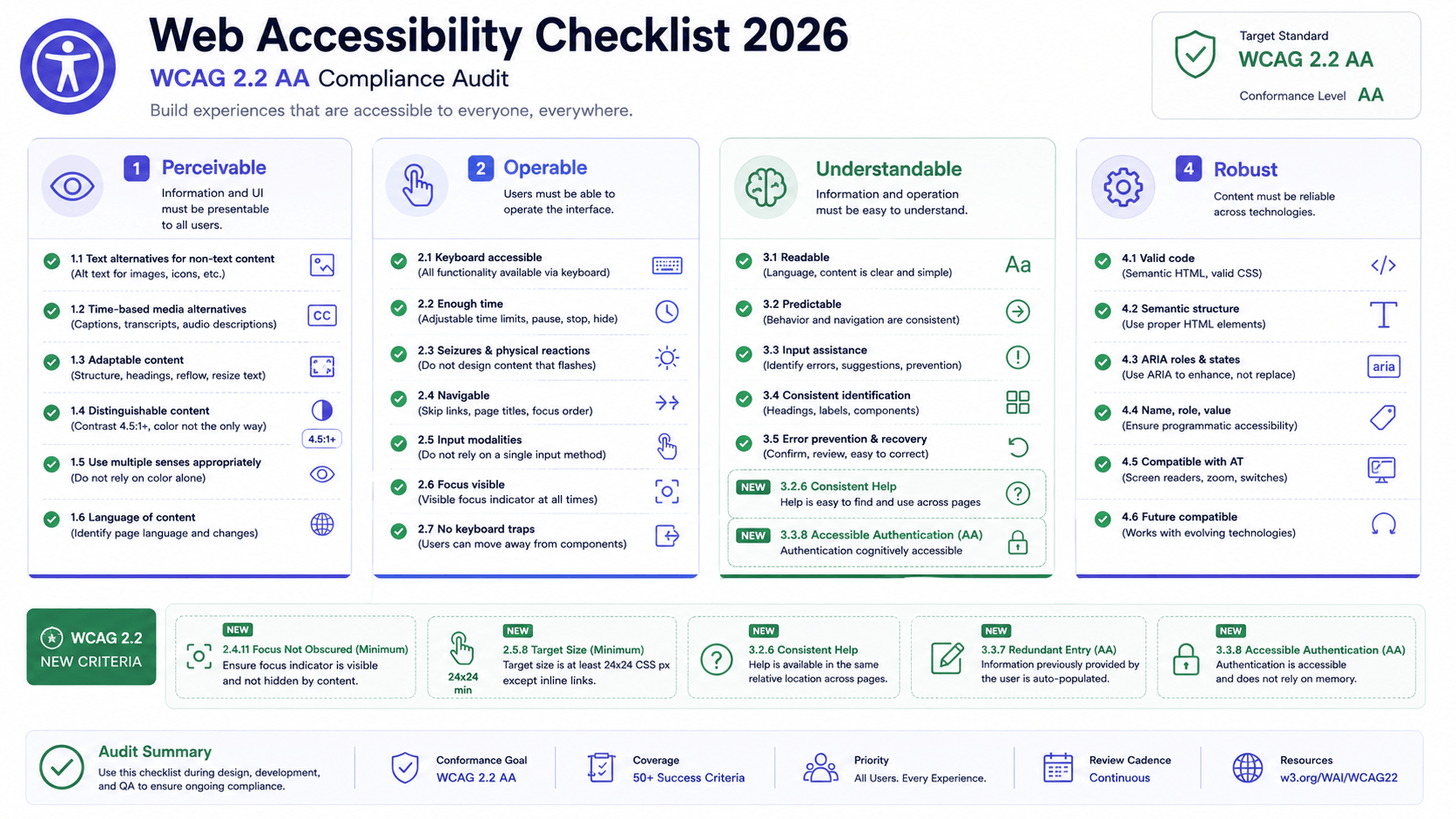
Several wcag-2026" class="internal-link">accessibility practices sit right at the heart of responsive work. Support text resizing up to 200 percent without loss of content or function, which is a direct WCAG requirement and a natural consequence of using relative units. Maintain color wcag-2026" class="internal-link">contrast ratios of at least 4.5 to 1 for normal text and 3 to 1 for large text, and remember that wcag-2026" class="internal-link">contrast requirements apply in dark mode too, where light-on-dark palettes often fall short if not checked. Ensure a logical focus order and visible focus indicators so keyboard users can navigate the responsive layout, especially important when elements reflow and the visual order changes.
Honor the prefers-reduced-motion preference by dampening or removing large animations and parallax effects for users who experience motion sickness or vestibular disorders. Use semantic HTML, real headings, lists, buttons, and landmarks, so assistive technology can understand your structure regardless of how it is visually arranged. And be careful that responsive reordering does not desynchronize the visual order from the DOM order in ways that confuse wcag-2026" class="internal-link">screen reader and keyboard users, since those tools follow the source order. When you use CSS to reorder content, verify that the reading and focus sequence still makes sense.
mobile-first-design-strategy-2026" class="internal-link">Container queries and logical properties, mentioned earlier, are wcag-2026" class="internal-link">accessibility wins too: the former lets components adapt to give content the room it needs, and the latter ensures correct behavior in right-to-left languages and vertical writing modes. Accessible responsive design is not extra work bolted on at the end. It is the same disciplined, user-centered work done thoroughly.
A Practical Responsive Workflow and Checklist
Bringing all of this together, here is the workflow we lean on. It is deliberately ordered so that each stage sets up the next, and it front-loads the decisions that are expensive to change later.
The workflow
Start with content and priority. Before opening a design tool, rank the content and actions for each key screen. This ranking becomes your mobile reading order and your source of truth for what matters.
Design mobile-first. Lay out the smallest screen first, making the hard prioritization calls, then design the larger breakpoints as enhancements. Establish your type scale, spacing scale, and color system as reusable tokens from the very beginning so everything stays consistent.
Build on fluid foundations. Write base styles in relative units, use grid and flexbox with intrinsic sizing so layouts flex without breakpoints wherever possible, and reach for clamp to make typography and spacing scale smoothly. Add mobile-first-design-strategy-2026" class="internal-link">container queries so components adapt to their context.
Add breakpoints only where content demands them. Resize slowly, watch for the moments the design breaks down, and place min-width breakpoints there, defined in em. Keep the number of breakpoints as small as the design allows.
Optimize media and performance throughout. Implement responsive images with srcset, sizes, and the picture element, serve modern formats, set explicit dimensions, lazy-load below-the-fold images, and hold yourself to a performance budget under throttled mobile conditions.
Test broadly and continuously. Use browser dev tools for fast iteration, then validate on real devices, across orientations, input methods, zoom levels, color schemes, and network speeds, guided by your real analytics.
The pre-launch checklist
Before any responsive site ships, run through a final pass covering the essentials:
- The layout works fluidly at every width from roughly 320 pixels to ultra-wide, with no horizontal scrolling and no awkward gaps between breakpoints.
- Body text is at least 16 pixels, line length stays in the 45 to 75 character range on wide screens, and everything remains usable at 200 percent zoom.
- All interactive elements are at least 44 by 44 pixels with adequate spacing, and primary actions sit within comfortable thumb reach on mobile.
- Images use srcset and sizes with accurate values, serve modern formats with fallbacks, carry explicit dimensions, and lazy-load where appropriate.
- Core Web Vitals hit their targets on a mid-range phone over a throttled connection: LCP under 2.5 seconds, INP under 200 milliseconds, CLS under 0.1.
- Color contrast passes in both light and dark modes, focus order is logical with visible indicators, reduced-motion and text-resize preferences are honored, and the source order matches the reading order.
- The site has been verified on at least one real iOS device and one real mid-range Android device, across portrait and landscape, with keyboard and screen reader navigation checked.
Closing Thoughts
Responsive web design that actually works is not the product of any single clever technique. It is the cumulative result of a mobile-first mindset, fluid foundations, content-driven breakpoints, modern CSS used with intention, disciplined typography and spacing, carefully optimized images, generous touch targets, a genuine commitment to performance, real wcag-2026" class="internal-link">accessibility, and honest testing on real hardware. Each piece reinforces the others, and skipping any one of them is usually where the experience quietly falls apart.
The encouraging news is that the platform has never been more capable. mobile-first-design-strategy-2026" class="internal-link">Container queries, clamp, intrinsic sizing, logical properties, and modern image formats are all shipping in every major browser today, and they let you express adaptive intent directly rather than patching around limitations with ever more breakpoints. Lean into these tools, hold yourself to measurable standards like the Core Web Vitals thresholds, and keep testing on the devices your users really hold.
At UI Designer we treat responsiveness not as a final checkbox but as a property that is designed in from the first content decision to the last device test. Build that way, and your interfaces will feel considered and effortless on a small phone in poor signal, on a foldable mid-unfold, and on a vast desktop display alike, which is exactly what responsive design promised all along and what, done properly, it genuinely delivers.