

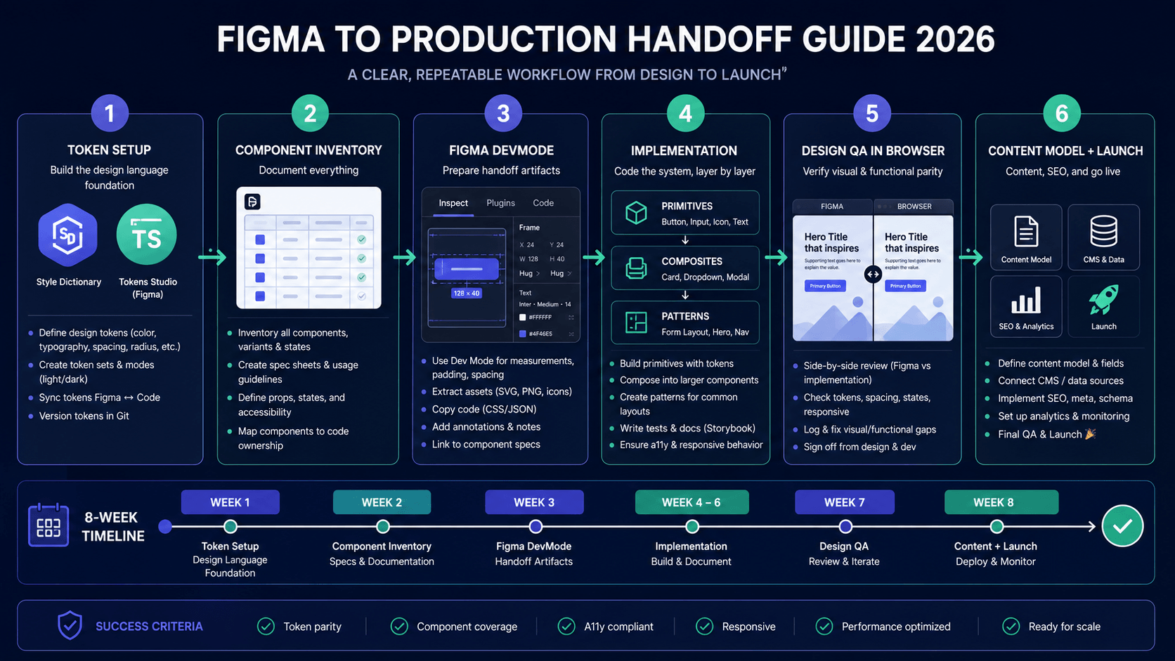
You have a Figma file. You need a working website. The gap between "design looks good" and "website performs" is where projects die — timeline slips, budget overruns, "it doesn't match the design," "mobile is broken," "Google can't crawl it."
This guide is the figma-to-production-handoff-guide-2026" class="internal-link">handoff protocol we use at UI Designer to go from Figma to production without the usual chaos. It works whether you're an agency handing to devs, a designer working with a freelancer, or an in-house team.
The Handoff Problem
DESIGNER                          DEVELOPER
    │                                 │
    ▼                                 ▼
┌─────────┐                       ┌─────────┐
│ "Here's │                       │ "Which  │
│  the    │                       │  font?  │
│  Figma  │                       │  What's │
│  link"  │                       │  the    │
└─────────┘                       │  spacing│
    │                             │  scale? │
    │                             │  Hover? │
    ▼                             │  Focus? │
                               ┌─────────┐
                               │ "I'll   │
                               │  guess" │
                               └─────────┘
    │                                 │
    ▼                                 ▼
┌─────────────┐                   ┌─────────────┐
│  3 weeks    │                   │  6 weeks    │
│  later:     │                   │  later:     │
│  "Why     ───▶│  "Why doesn't │
│  doesn't   │   │  it match?" │
│  it match?"│   │             │
└─────────────┘                   └─────────────┘
**Root cause:** Designers hand off *visuals*. Developers need *specifications*.
---
Phase 1: Before Design Starts (The Setup)
1. Shared Design Token System (Single Source of Truth)
**Don't design in Figma, then recreate in code. Define once, use everywhere.**
// tokens/design-tokens.json (Style Dictionary format)
{
  "color": {
    "primary": { "500": { "value": "#2563eb", "type": "color" } },
    "semantic": {
      "background": { "value": "{color.neutral.50}", "type": "color" },
      "foreground": { "value": "{color.neutral.900}", "type": "color" }
    }
  },
  "spacing": { "4": { "value": "1rem", "type": "dimension" } },
  "typography": {
    "fontFamily": { "sans": { "value": "Inter, system-ui", "type": "fontFamily" } },
    "fontSize": { "lg": { "value": "1.125rem", "type": "fontSize" } }
  }
}
**Tooling:** Style Dictionary → outputs CSS custom properties, Figma Variables (Tokens Studio), TypeScript constants.
**Figma Setup:** Use **Tokens Studio plugin** → syncs bidirectionally with JSON. Designers edit in Figma, tokens update in code.
2. Component Inventory (Before High-Fi)
Audit every unique component needed. Create a **Component Spec Sheet**:
| Component | Variants | States | Breakpoints | Priority | |-----------|----------|--------|-------------|----------| | Button | Primary, Secondary, Outline, Ghost, Destructive | Default, Hover, Focus, Active, Disabled, Loading | All | P0 | | Input | Text, Email, Password, Search | Default, Focus, Error, Disabled, Filled | All | P0 | | Card | Default, Elevated, Outlined, Interactive | Default, Hover, Focus | All | P0 | | Modal | Small, Medium, Large, Fullscreen | Open, Closing, Closed | All | P1 | | Dropdown | Single, Multi, Searchable | Default, Open, Focus, Disabled | All | P1 | | Table | Default, Sortable, Selectable, Expandable | Default, Hover Row, Loading, Empty | Desktop/Tablet | P1 | | Tabs | Default, Vertical, Icon+Label | Default, Active, Focus, Disabled | All | P1 | | Toast | Success, Error, Warning, Info | Enter, Exit, Persistent | All | P0 |
**Output:** Shared Notion/Google Sheet. Both design and dev sign off.
3. Breakpoint Agreement
/* Agreed breakpoints — no surprises */
/* Mobile: 320px - 767px */
/* Tablet: 768px - 1023px */
/* Desktop: 1024px - 1439px */
/* Wide: 1440px+ */
--breakpoint-sm: 640px; --breakpoint-md: 768px; --breakpoint-lg: 1024px; --breakpoint-xl: 1280px; --breakpoint-2xl: 1536px;
---
Phase 2: During Design (Design for Developers)
4. Figma File Structure (Developer-Friendly)
📁 Design System
  📁 01 Tokens (Color, Spacing, Typography, Shadows, Radius, Motion)
  📁 02 Primitives (Button, Input, Badge, Avatar, Icon, Tooltip)
  📁 03 Composites (Card, Dropdown, Tabs, Modal, Toast, Table)
  📁 04 Patterns (FormLayout, Header, Footer, Hero, PricingTable)
  📁 05 Templates (Homepage, Landing, Dashboard, Article, Settings)
📁 Pages 📄 Homepage 📄 Pricing 📄 Case Study Template 📄 Blog Article Template 📄 Dashboard Overview
📁 Flows 📄 User Journey: Signup → Onboarding → First Project 📄 Checkout Flow 📄 Password Reset
📁 Specs (Auto-generated via DevMode)
**Naming Convention:** `Component/Variant/State` — e.g., `Button/Primary/Hover`, `Card/Elevated/Default`
5. Auto Layout Everything
- **Frames > Groups** — Auto layout = Flexbox/Grid in code
- **Constraints** — "Left & Right" = `width: 100%`, "Center" = `margin: 0 auto`
- **Spacing** — Use token values (8, 16, 24, 32) not arbitrary numbers
- **Resizing** — "Fill container" = `flex: 1`, "Hug contents" = `fit-content`
6. Component Variants (Not Separate Frames)
// One Button component with variants:
Variant 1: Type=Primary, Size=Large, State=Default
Variant 2: Type=Primary, Size=Large, State=Hover
Variant 3: Type=Secondary, Size=Medium, State=Focus
// ... not 20 separate button frames
**Maps directly to:** `cva` (class-variance-authority) in code.
7. Design for All States (The "Invisible" 60%)
Every interactive component needs:
- [ ] Default
- [ ] Hover
- [ ] Focus (keyboard — **visible ring**, not browser default)
- [ ] Active/Pressed
- [ ] Disabled
- [ ] Loading
- [ ] Error (for inputs)
- [ ] Empty (for lists/tables)
**Don't design just the happy path.**
8. Responsive Design: Mobile-First in Figma
- **Start at 360px** (iPhone SE / small Android)
- **Show expansion** at 768px, 1024px, 1440px
- **Use "Constraints" + "Auto Layout"** to demonstrate behavior
- **Document breakpoints** where layout changes (not just "it scales")
9. Interaction Specs (Prototype + Annotations)
**Prototype:** Clickable flows for user testing. **Annotations (DevMode):** For developers who don't prototype.
| Interaction | Annotation Format | |-------------|-------------------| | Button click | `onClick: navigate('/dashboard')` | | Form submit | `POST /api/auth/login → redirect /dashboard` | | Modal open | `Dialog.open({ trigger: 'button[data-action="settings"]' })` | | Toast | `toast.success('Saved') — auto-dismiss 3s` | | Dropdown | `Select.open() — keyboard: ArrowUp/Down, Enter, Escape` | | Carousel | `Embla Carousel — loop: true, align: center, dragFree: true` |
---
Phase 3: Handoff Package (What You Actually Deliver)
10. The Handoff Checklist (Designer → Developer)
✅ FIGMA FILE
  ☐ Organized per structure above
  ☐ All components use design tokens (no hardcoded values)
  ☐ Auto layout applied correctly
  ☐ Variants defined for all component states
  ☐ Responsive breakpoints shown (360, 768, 1024, 1440)
  ☐ DevMode annotations on all interactive elements
  ☐ Prototype flows for critical paths
  ☐ Fonts: Variable fonts preferred, or static weights defined
  ☐ Icons: SVG components, not images
  ☐ Images: Exported as WebP/AVIF at 1x, 2x, 3x (or use Next.js Image)
✅ DESIGN TOKENS (Exported) ☐ tokens/design-tokens.json (Style Dictionary source) ☐ Figma Variables synced (Tokens Studio) ☐ CSS custom properties file generated ☐ TypeScript token types generated
✅ ASSETS ☐ /icons — SVG, optimized, named semantically (icon-arrow-right.svg) ☐ /images — WebP/AVIF, responsive widths, descriptive names ☐ /fonts — WOFF2, subsetted (Latin only unless i18n) ☐ /illustrations — SVG or optimized WebP
✅ DOCUMENTATION (Notion/Confluence/Markdown) ☐ Component inventory with status (Designed → Dev → QA → Done) ☐ Page-by-page spec: content, functionality, edge cases ☐ Interaction matrix (component × state × behavior) ☐ wcag-2026" class="internal-link">Accessibility notes (ARIA, focus order, announcements) ☐ Content model (if CMS) — field types, relationships, validation ☐ Animation specs (duration, easing, reduced-motion fallback)
✅ SIGN-OFF ☐ Designer: "Designs complete, tokens synced, specs documented" ☐ Developer: "Specs clear, tokens imported, component plan ready" ☐ PM: "Scope locked, timeline agreed, QA criteria defined"
---
Phase 4: Development (Build With Design System)
11. Developer Setup (Day 1)
# 1. Install design tokens package
npm install @your-org/design-tokens
# 2. Import in global CSS @import '@your-org/design-tokens/dist/css/tokens.css';
# 3. Configure Tailwind with tokens // tailwind.config.js const tokens = require('@your-org/design-tokens/dist/js/tokens.js');
module.exports = { theme: { extend: { colors: { primary: tokens.color.primary, semantic: tokens.color.semantic, }, spacing: tokens.spacing, fontSize: tokens.typography.fontSize, fontFamily: tokens.typography.fontFamily, } } };
# 4. Install component library (if provided) npm install @your-org/ui-components
12. Component Implementation Order
Week 1: Primitives (Button, Input, Label, Badge, Avatar, Icon, Tooltip)
Week 2: Composites (Card, Dropdown, Tabs, Modal, Toast, Table)
Week 3: Patterns (FormLayout, Header, Footer, Hero, PricingTable)
Week 4: Templates/Pages (assemble from patterns)
Week 5: Polish, QA, Accessibility, Performance
**Rule:** Don't start pages until primitives pass Design QA.
13. Design QA in Browser (Not Figma)
Designer reviews **live implementation** against Figma:
| Check | Tool | Pass Criteria | |-------|------|---------------| | Visual fidelity | Side-by-side (Figma + localhost) | ±2px spacing, ±1px typography | | Responsive | Chrome DevTools device toolbar | All breakpoints match | | States | Manual interaction | All 8 states work per component | | wcag-2026" class="internal-link">Accessibility | axe DevTools + Keyboard + NVDA | Zero violations, logical focus | | Performance | Lighthouse CI | LCP <2.5s, CLS <0.1, TBT <200ms |
**Feedback loop:** Shared FigJam/Notion board → "Design QA" column → Dev fixes → Designer verifies → Done.
---
Phase 5: Figma DevMode (The Modern Handoff)
14. What DevMode Gives You (Use It)
- **Inspect:** CSS, dimensions, tokens, assets — copy-paste ready
- **Annotations:** Designer notes on specific layers
- **Assets:** Export SVG/WebP/PNG at any scale
- **Components:** Variant playground, code snippets
- **Notifications:** "Design updated" alerts for developers
15. DevMode Workflow
Designer: Publishes update → "Ready for dev" section
    │
    ▼
Developer: Gets notification → Opens DevMode
    │
    ▼
Developer: Inspects changed component → Copies CSS/tokens
    │
    ▼
Developer: Updates code → Commits → PR
    │
    ▼
Designer: Reviews PR preview deployment → Approves / Requests changes
---
Phase 6: Content & CMS Handoff
16. Content Model Spec (If CMS Involved)
# content-model.yaml
contentTypes:
  caseStudy:
    name: Case Study
    fields:
type: string required: true validation: { maxLength: 100 }
type: uid source: title
type: reference target: client required: true
type: asset required: true validations: { mimeTypes: ['image/webp', 'image/avif'], maxSize: '2MB' }
type: richText enabledMarks: [bold, italic, link] enabledBlocks: [heading2, paragraph, bulletList]
type: array items: type: object fields:
ui: preview: true previewFields: [title, client, heroImage]
- name: title
- name: slug
- name: client
- name: heroImage
- name: challenge
- name: results
- metric: string
- value: string
- description: text
17. Content Migration Plan
| Phase | Action | Owner | |-------|--------|-------| | 1 | Audit existing content (ROT analysis) | Content Strategist | | 2 | Map old fields → new content model | Designer + Dev | | 3 | Write redesign-checklist-50-steps" class="internal-link">migration scripts | Developer | | 4 | Test import on staging | QA | | 5 | Content entry (new content) | Content Team | | 6 | Review + approve | Designer + Stakeholder |
---
The 10 Most Common Handoff Failures (And Fixes)
| # | Failure | Symptom | Fix | |---|---------|---------|-----| | 1 | **No token system** | Colors/spacing differ everywhere | Style Dictionary + Tokens Studio | | 2 | **Missing states** | Hover/focus/loading broken in prod | Design all 8 states per component | | 3 | **Desktop-only designs** | Mobile layout broken | Mobile-first Figma frames | | 4 | **Hardcoded values in Figma** | Can't update globally | Bind everything to variables | | 5 | **No interaction specs** | Dev guesses behavior | DevMode annotations + prototype | | 6 | **Fonts not specified** | Fallback fonts, layout shift | Document weights, `font-display: swap` | | 7 | **Images not optimized** | Slow LCP, huge bundle | Export WebP/AVIF, use Next.js Image | | 8 | **No component inventory** | Dev builds wrong components | Shared spec sheet, signed off | | 9 | **Content model missing** | CMS built wrong | Content model YAML before CMS setup | | 10 | **No Design QA process** | Visual bugs ship | Browser review, not Figma review |
---
Timeline: Realistic Handoff Schedule
| Week | Designer | Developer | Joint | |------|----------|-----------|-------| | 1 | Token setup, component inventory | Repo setup, token import, Tailwind config | Kickoff, agree breakpoints | | 2 | Primitives design (all states) | Primitives implementation | Design QA primitives | | 3 | Composites design | Composites implementation | Design QA composites | | 4 | Patterns + Templates | Patterns + Templates | Design QA patterns | | 5 | Page designs, content model | Page assembly, CMS setup | Content model review | | 6 | Responsive refinement, annotations | Responsive implementation | Full Design QA | | 7 | Prototype flows, wcag-2026" class="internal-link">accessibility notes | Interactions, a11y implementation | wcag-2026" class="internal-link">Accessibility audit | | 8 | Final review, asset export | Performance optimization, launch prep | Launch checklist |
**Total: 8 weeks for ~20-page site with design system.** Adjust for scope.
---
Tools We Recommend (2026)
| Category | Tool | Purpose | |----------|------|---------| | **Tokens** | Style Dictionary + Tokens Studio | Single source, multi-platform | | **Design** | Figma (DevMode, Variables, Auto Layout) | Design + figma-to-production-handoff-guide-2026" class="internal-link">handoff | | **Components** | React + TypeScript + Tailwind + CVA + Radix UI | Accessible, typed, performant | | **Documentation** | Notion / GitBook / Storybook | Specs, component library | | **Prototyping** | Figma Prototype + Playwright (for testing) | Flows + E2E tests | | **QA** | axe DevTools, Lighthouse CI, Chromatic | A11y, perf, testing-strategies-2026" class="internal-link">visual regression | | **CMS** | Sanity / Contentful / Strapi / Payload | Content management | | **Deployment** | Vercel / Netlify / Cloudflare Pages | Preview deploys, edge |
---
The UI Designer Handoff Guarantee
When we design, we deliver:
- **Complete token system** — Synced Figma ↔ Code
- **Component library** — 40+ primitives/composites, all states, accessible
- **DevMode-ready Figma** — Annotated, organized, responsive
- **Content model** — CMS-agnostic, validated
- **Design QA process** — Browser review, not guesswork
- **Documentation** — Specs, interaction matrix, animation guide
- **Implementation support** — We're in your Slack during dev
**Result:** Design-to-code fidelity >95%. Zero "it doesn't match" surprises. Launch on time.
---
Ready for Smooth Handoffs?
Book a **Design-to-Dev Workshop** — we'll audit your current process, set up the token system, and run a pilot figma-to-production-handoff-guide-2026" class="internal-link">handoff with your team.
ui-designer.in/figma-to-production-handoff-guide-2026" class="internal-link">handoff-workshop
Frequently Asked Questions
Frequently Asked Questions
- What's the biggest handoff mistake teams make?
- Designers hand off visuals; developers need specifications. The gap: no token system, missing states (hover, focus, loading), no responsive specs, no interaction documentation. Result: developers guess, fidelity drops, timeline slips.
Frequently Asked Questions
- Do I need Figma DevMode if I have Zeplin/Storybook?
- DevMode is free for Figma users and integrates directly with your design file. Zeplin adds cost and sync step. Storybook is for code components. Best workflow: Figma DevMode for design → Storybook for component library → GitHub for version control.
Frequently Asked Questions
- How do I handle responsive design in handoff?
- Design mobile-first at 360px. Show expansion at 768px, 1024px, 1440px. Use Auto Layout + Constraints in Figma so developers see exact flexbox/grid behavior. Document breakpoints where layout changes (not just "it scales").
Frequently Asked Questions
- What if designers and developers disagree on fidelity?
- Define "Design QA" criteria upfront: ±2px spacing, ±1px typography, all 8 states working, keyboard accessible, Lighthouse ≥90. Designer reviews live implementation in browser, not Figma. Document discrepancies in shared tracker.
Frequently Asked Questions
- Should tokens live in Figma or code?
- Single source of truth in code (Style Dictionary JSON). Figma syncs via Tokens Studio plugin. Designers edit in Figma, tokens auto-sync to code. Code never edits tokens directly. This prevents drift.
Frequently Asked Questions
- How do I handle dark mode in handoff?
- Define both light/dark tokens in Style Dictionary. Figma: create two token sets (light/dark) with Tokens Studio. Components: use semantic tokens (`color-background`, not `color-white`). Test both modes in Design QA.
Frequently Asked Questions
- What's the ideal designer-to-developer ratio for handoff?
- 1 designer : 2-3 developers max. More developers = more interpretation variance. Pair designer with lead dev for daily sync. Use shared Slack channel, not email/PDFs.