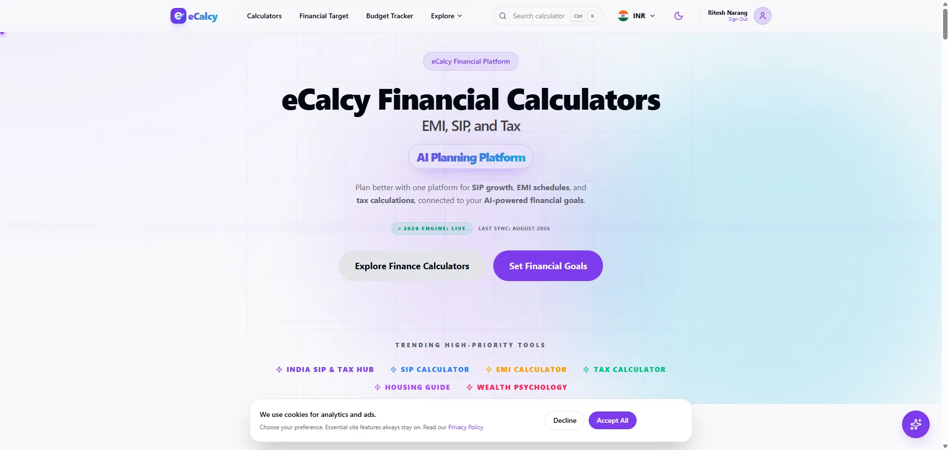
eCalcy is a live financial calculator platform serving users in India and globally with SIP, EMI, tax, and fixed-deposit tools. UI Designer designed and developed the platform — information architecture, responsive interface design, calculator UX, and production frontend delivery — so a large tool library stays fast, clear, and easy to navigate.
A calculator directory can quickly become overwhelming if every tool and category is presented with equal weight. eCalcy organizes dozens of calculators and country-specific variants.
Users arrive with a specific calculation in mind, so navigation and page structure need to guide them to the right tool in seconds.
Financial tools live or die on trust: inputs, assumptions, and results must be transparent, and the interface must feel dependable on every screen size.
The product needed a content structure that could scale as new calculators, countries, and topical guides were added — without redesigning the site each time.
Strategy
Designed an information architecture that groups calculators by use case (SIP, EMI, tax, FD) and by country, making the most-used tools immediately visible and secondary paths clear.
Led every page with its purpose so visitors understand what a tool does before they interact with it.
Built the delivery on reusable, design-system-driven frontend patterns instead of one-off page designs, so new tools inherit a consistent experience.
Treated technical SEO as part of the product: semantic, crawlable page structures, sitemaps, and clear metadata so tool pages are discoverable.
Goals
Make a large calculator library easy to scan and navigate by organizing dozens of tools around real use cases and countries.
Let users reach the right tool quickly and understand the inputs and assumptions before they calculate.
Deliver a responsive, trustworthy interface that performs well on phones, tablets, and desktop.
Build a scalable content and design foundation that supports new calculators, countries, and guides without a redesign.
UX / UI
A clean, focused interface that keeps the calculator front and center without visual noise.
Consistent components for cards, inputs, result areas, navigation, and feedback states so the whole library feels like one product.
Clear hierarchy, strong contrast for primary actions and results, and spacious layouts for complex choices.
Form UX built for manageability: plain-language labels, inline validation, preserved input on error, and result screens that explain what the number means.
Development
Component-driven frontend implementation where shared UI patterns — cards, inputs, result areas, and navigation — are reused across every tool and country variant.
Calculator engines implemented around transparent financial methodology, including XIRR for SIP returns and amortization schedules for EMIs, with inputs and assumptions surfaced to the user.
Clean semantic markup and lean styling keep the platform fast and maintainable as the tool library grows.
Responsive design
Layouts and interactions are planned for mobile, tablet, and desktop, with calculators remaining usable in portrait orientation on smaller screens.
Primary actions and result states stay reachable and legible on phones without zooming or horizontal scrolling.
Accessibility
Semantic page structure and descriptive headings support keyboard navigation and assistive technology.
Form fields use clear labels, inline validation, and descriptive error messaging, with contrast and touch targets reviewed so the tools remain usable across devices.
Key features
Category-based navigation
Calculators organized by use case and country so users can find the right tool fast.
Financial calculator engines
SIP (XIRR), EMI (amortization), income tax, and fixed-deposit tools with transparent inputs and assumptions.
Country-specific variants
Localized tools and tax rules across 15+ countries, all served from one consistent component system.
Programmatic SEO architecture
Semantic, crawlable tool pages with clear metadata and sitemaps so the library is discoverable.
Responsive interface design
A consistent, readable experience across mobile, tablet, and desktop.
Technology & delivery
Responsive frontend development with production-ready, maintainable code.
Design-system-driven components reused across calculator categories and countries.
Calculator engines implemented around transparent financial methodology — including XIRR for SIP returns and amortization schedules for EMIs — with inputs and assumptions surfaced to the user.
Performance-aware delivery: lean markup, optimized assets, and clean semantics across desktop and mobile.
SEO & performance
Semantic, crawlable page structure that supports indexing of individual tool pages.
Clear, unique metadata and descriptive headings per tool and country hub.
Sitemap and content organization that aids discoverability as the tool library grows.
Optimized images and lean frontend code for fast loading.
Responsive delivery across device sizes with primary actions kept reachable on mobile.
Clean CSS and markup to keep pages lightweight.
Outcomes
Live, production platform
A financial calculator platform running for users in India and globally, with tool pages that are discoverable and easy to navigate.
Scalable foundation
A design system and information architecture that support ongoing growth of tools, countries, and content.
Clear digital product experience
Users can reach the right calculator, understand the inputs and assumptions, and trust the result — on any device.
Common questions
Was eCalcy designed and developed by UI Designer?
Yes. The live site is credited as designed and developed by UI Designer (ui-designer.in). This is a self-initiated product (not a client engagement) covering information architecture, responsive interface design, calculator UX, and production frontend development.
What was the engineering focus?
A scalable, component-driven frontend where dozens of calculators and country variants share one design system, plus transparent calculator logic (XIRR for SIP, amortization for EMI) and performance-aware delivery.
How does the design support trust?
Financial tools need clarity. Inputs, assumptions, and results are surfaced to the user, validation happens close to the field, and result screens explain what the numbers mean.
Can this structure apply to my project?
Yes. Category-based navigation, programmatic page architectures, and scalable design systems apply well to directories, product catalogs, and tool-based platforms.
Have a project like this in mind?
Share your brief and we will prepare the right scope, approach, and next step.